Album cover of the week: Paranoid
Is there anything left to say about the music on Black Sabbath’s Paranoid? It, even more than their debut album from earlier in 1970, pretty much became the template for heavy metal. “Iron Man,” “War Pigs,” and “Electric Funeral” are some of the most essential songs of all-time. But man, what’s up with that cover?
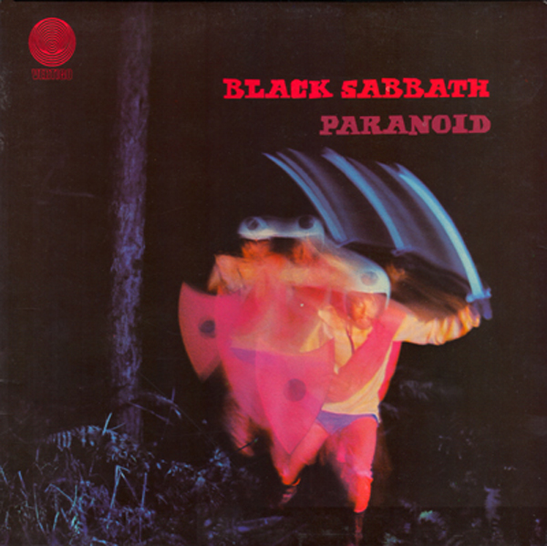
So the background on this weird dude is this – Sabbath originally wanted to call the album War Pigs, and that’s what the guy in the Day-Glo outfit, sword, and shield is supposed to be. Vertigo, the band’s label, was uncomfortable with that title since the Vietnam War was going on and they didn’t want to offend people. I guess they figured a lot of pro-war types were Sabbath fans too?
So anyway, they switched the title to match the second song on the record, “Paranoid.” But it wasn’t just pure record company cowardice at work here. They pegged “Paranoid” as single material and were also hoping to boost sales by changing the record title. Problem is, once the title was changed the cover art made no sense at all.
It’s a neat photo all the same, although it would be ridiculed were it put on a modern metal disc. Love the title font, though, which looks like something from a 1950s horror movie starring Vincent Price or Christopher Lee.
Photography and album design for Paranoid is by Marcus Keef, known mostly as just “Keef.” He did a number of other covers for the Vertigo and Neon (RCA) labels in the ’70s, including Sabbath’s first album and their third, Master of Reality.
Related articles
- DVD Review: Black Sabbath – Paranoid (Classic Albums Series) (blogcritics.org)
- OZZY OSBOURNE Says BLACK SABBATH “Are In The Talking Process” Regarding Reunion, New Album (bravewords.com)
- BLACK SABBATH – Tony Iommi Talks ‘Paranoid’ In Part II Of Total Guitar Interview (bravewords.com)

People found this post by searching for:
- "paranoid album cover", "black sabbath paranoid album cover", "black sabbath paranoid cover art", "black sabbath paranoid cover", "paranoid cover art", "MARCUS KEEF", "black sabbath paranoid artwork", "Paranoid Cover"
Ken Chamberlain
i think maybe the guy is roger bain (producer of the album) ? and to make sense of the album cover, a guy so paranoid, he walks around with a sword;and shield for protection?