The Best and Worst Major League Baseball Logos (AL Central)
With the 2012 Major League Baseball season nearly upon us, now is as good a time as any to obsess once again on one of my favorite topics — logos. So I’m going to offer up my choices for the best and worst team baseball logos for all 30 current MLB franchises. Primary, alternate, and cap logos listed on Chris Creamer’s outstanding logo website are all under consideration. Today I look at the five squads of the American League’s Central division.
(Past recaps — AL West, NL West)
Chicago White Sox
Best

What I like about the White Sox’s current primary logo (rolled out in 1991) is that it looks like something the team would’ve worn in the ’20s, but doesn’t seem stodgy. In fact, this is a slightly updated version of the alternate logo Chicago used throughout the 1950s.
Worst

Tough call here. I can’t really bag on the logos the team used at the beginning of the 20th century — they were pretty standard for the time and it’s not like sports graphics of that era were terribly sophisticated anyway. And although the team’s logo and uniforms from the late ’70s and 1980s aren’t exactly looked upon with fondness, at least they tried something fresh.
But this — this is just weak sauce. Surely there were enough talented designers by the early ’70s to produce something better with even five minutes of effort. Yeah the white sock is there, but this is so generic and bland.
Cleveland Indians
Best

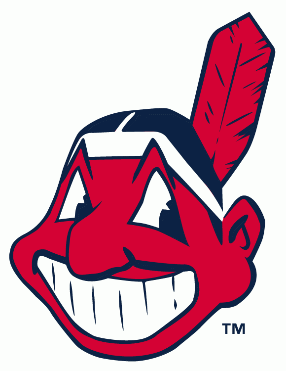
I’m not interested in debating the racism angle of this logo. From a purely aesthetic standpoint it’s really cool. There’s a reason why Cleveland brought this back in 1980, only eight years after the logo’s original 1951-1972 run — it’s instantly identifiable and looks like no other logo in baseball. Long live Chief Wahoo!
Worst

See, this is what you get when you let your kid design a team logo. I’ll give the team credit for coloring inside the lines on the headdress, even though it’s not finished. Maybe I’m missing something, and this is really a stylized map of Ohio made to look like a head? Whatever the case, this was used as the team’s primary logo in 1928 and replaced the next season.
Detroit Tigers
Best

Depicting a tiger on a logo should be a no-brainer, and yet every time Detroit tried it was a misfire. They finally got it right in 1994, just in time for the Tigers to begin one of the most dismal stretches in franchise history. This was replaced as the primary logo in 2006, but now serves as the alternate.
Worst

“Gah, derp! Is that a booger on my nose?”
Even though this was only used in 1927-28, its influence stretched into the 21st century. Witness Meatwad of Aqua Unit Patrol Squad 1 / Aqua Teen Hunger Force.

Kansas City Royals
Best

Props to the Royals for at least maintaining some consistency. Despite some tweaks in their primary logo — a darker blue and other cosmetic adjustments — it’s remained largely unchanged since the team’s founding in 1969. Unfortunately that makes my job harder, as there’s not much to choose from. Still, this primary logo is pretty nice.
Worst

This alternate logo — used from 2002-2005 — isn’t particularly egregious. It’s just rather plain. Not a big fan of the typeface in the black ring either. And hey, just because you throw the words “baseball club” in there doesn’t make it fancy or timeless.
Minnesota Twins
Best

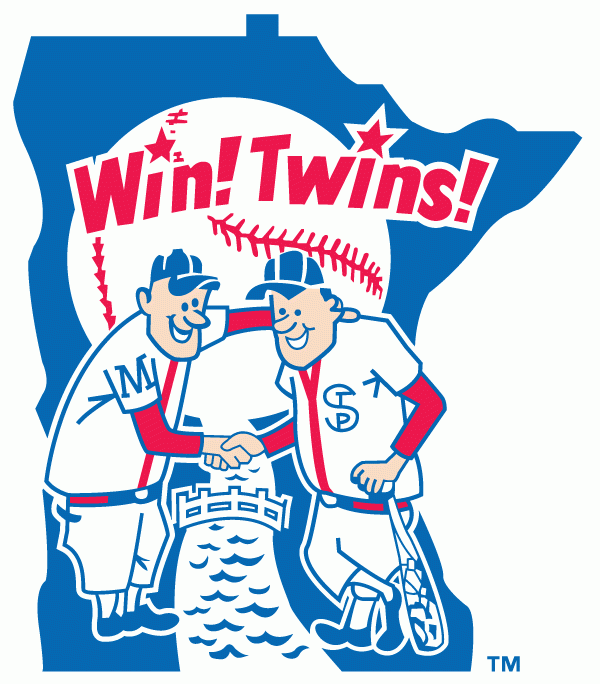
I know, I know. I’ve already slammed other logos as being cartoonish and then I go and pick this one as my favorite for the Twins. It’s packed with neat little touches but doesn’t feel crowded or overly busy. It’s also just so gosh-darn friendly and unique after all. I mean, if Minneapolis and St. Paul can get along why can’t the rest of us? Not everything in sports has to be aggressive.
Seriously, I do like this.
Worst

This, on the other hand, is a great example of how a cool design concept can also be executed poorly. It also screams ’70s, which is appropriate since this was rolled out in 1972.
People found this post by searching for:
- "white sox logo", "mlb logos", "Chicago White Sox Logo", "detroit tigers logo", "baseball logos 2012", "minnesota twins logo", "detroit tigers logo 2012", "cleveland indians logo 2012"
Dave Lifton
I agree about the best Twins logo. In fact, I almost bought this t-shirt until I realized it violated my rule on wearing logos of teams I don’t root for.
http://sports.yahoo.com/mlb/blog/big_league_stew/post/Playoff-anthem-Hold-Steady-singer-salutes-Minne?urn=mlb-271838