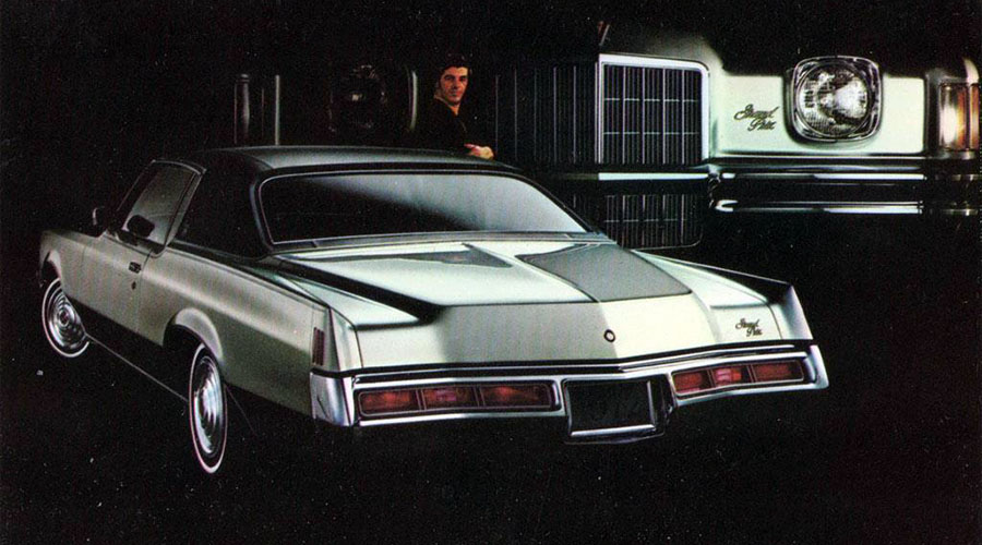
Featured Posts, Retrotisements Retrotisements — 1972 Pontiac New Car Lineup by Chris Holmes August 16, 2022 For the 1972 … Read the rest...
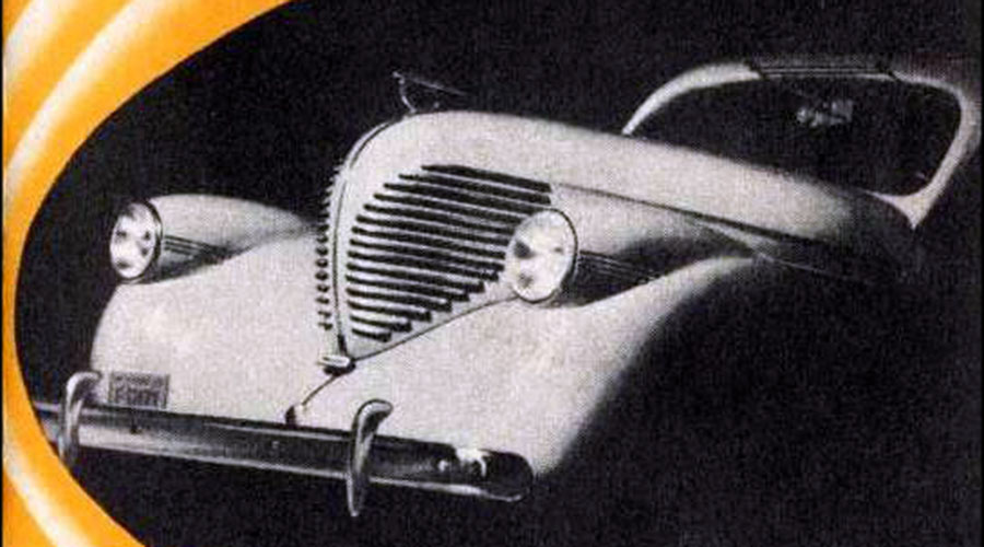
Ephemera Brochure Beauties #8: 1937 Willys, The Surprise Car of the Year! by Chris Holmes August 1, 2018 It’s … Read the rest...
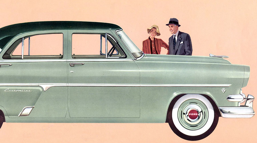
Photography Car Crazy #3: 1960 Dodge Polara by Chris Holmes August 30, 2016 The Dodge Po… Read the rest...
Advertising, Auction Finds Here’s A Classic Disney Hudson TV Ad Featuring Donald Duck by Chris Holmes January 6, 2015 Long before … Read the rest...
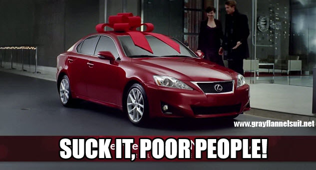
Advertising Congrats to Lexus on the Most Obnoxious Holiday Commercials of All-Time by Chris Holmes November 21, 2013 Lexus, a per… Read the rest...
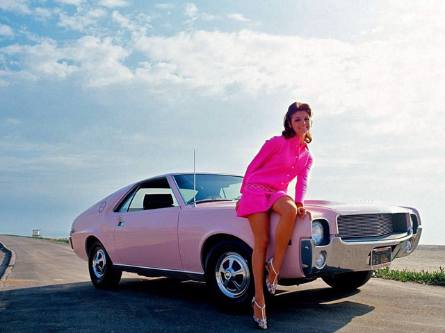
Photography Angela Dorian’s Playboy Playmate Pink 1968 AMX by Chris Holmes September 10, 2013 According t… Read the rest...
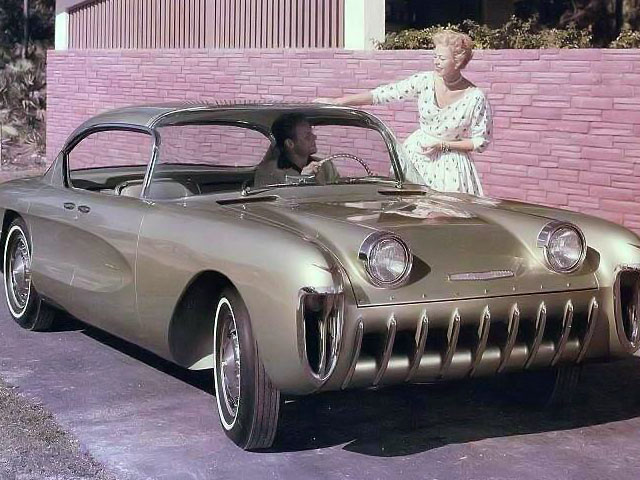
Capsules Concept Car Capsule: 1955 Chevrolet Biscayne by Chris Holmes August 14, 2013 Three years … Read the rest...
Vintage Photo Wednesday Vintage Photo Wednesday, Vol. 31: Classic American Cars (1930s – 1970s) Part 1 by Chris Holmes April 10, 2013 One of my fav… Read the rest...