Logo Evolution: ABC TV
Until the Fox television network went on the air in 1986, the American Broadcasting Company — ABC — was the young kid on the block. It began in 1943 as a direct descendant of RCA’s NBC Blue radio network. Originally known as the Blue Network, the network was re-branded in 1944 as the American Broadcasting Company. On April 19, 1948 the ABC television network went on the air, and so it is in that year that I begin my look at the history of the ABC-TV network logos.
Dates on some of the early logos are approximate. If any readers have more accurate information please let me know in the comments. To check out my history of the NBC logo, click here.
Logo #1 (1948 – ?)

1948
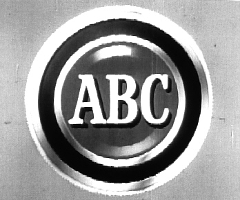
Not surprisingly, ABC’s first television logo was directly inspired by radio — the same is true for NBC as well. Basically, ABC took their radio network logo and slapped the letters “TV” on it. This specimen is a modern reproduction of the original.
Logo #2 (1948 – ?)

1948 – ?
I don’t have a hard date range for this logo, which features the American Broadcasting Company wordmark imposed over a map of the United States, but it seems to have been used from 1948 until the early ’50s.
Logo #3 (1948 – ?)

1948 – ?
As you might have figured out by now, standardization was not a priority for ABC’s marketing team in the ’40s and early ’50s. In fact, for several years the network scrambled to compete with NBC, CBS, and the DuMont networks.
Logo #4 (1953 – 1957)

1953-57
ABC, which struggled for several years after its launch, took on new life when it merged with United Paramount Theaters in 1953. And with that new life came a fancy new logo, featuring an eagle and a circle of 13 stars surrounding the letters “ABC”. By 1955 the logo was animated to reveal the ABC script bursting from a star in the center of the shield.
Logo #5 (1957 – 1962)

1957-62, the “Circle A” logo
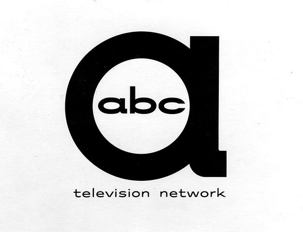
ABC took the unusual step of rendering their logo in all lower-case letters when they introduced the so-called “Circle A” logo in 1957.
Logo #6 (late 1950s – early 1960s)

1958 – 1962?
I don’t know how widespread this logo was, but it’s clearly an updating of the original map logo. My guess it was used in the same ’58 – ’62 period as the Circle A logo. I know the boxed portion was definitely used in 1958, as I saw it at the end of a promo for The Patti Page Oldsmobile Show.
Logo #7 (1962 – 2007)

1962 – 2007
Here’s the ABC logo that several generations of TV viewers know quite well. It was created by noted graphic designer Paul Rand and debuted on October 19, 1962. The lower-case wordmark remained from the Circle A variant, although it was updated to a sans serif typeface. Several variations of this classic logo were used over the following decades, including this neat one touting ABC’s new color programming:

Logo #8 (2007 – present)

2007 – present
In 2007 ABC rolled out an update to their classic logo, adding contours and shading to help usher in the HDTV generation. Otherwise, it’s essentially the same logo as introduced in the 1960s.
Ted
The person who came up with the lowercase “abc” in Logo #5 was certainly onto something. The uppercase logos don’t have that certain eye-catching punch that is achieved with the lowercase versions.