Ephemera Car Crazy #6: 1977 Lincoln Continental Town Coupé by Chris Holmes April 30, 2021 Soft lighti… Read the rest...
Ephemera Postcards from the Past #3: Merry Christmas from Bethlehem, PA by Chris Holmes December 23, 2020 Here’… Read the rest...
Ephemera Celebrate Thanksgiving with the Navy Pacific Reserve Fleet (1952) by Chris Holmes November 24, 2020 Here is a won… Read the rest...
Ephemera Postcards from the Past #2: Labor Day at Dorney Park by Chris Holmes August 20, 2020 There is no p… Read the rest...
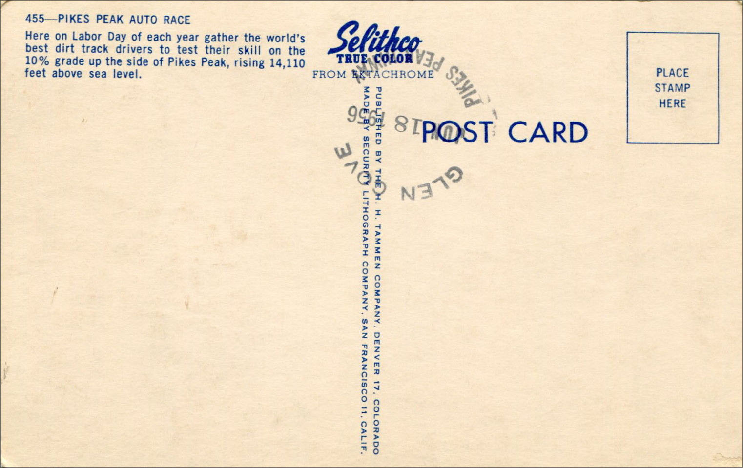
Ephemera Postcards from the Past #1: Pike’s Peak Auto Race, 1950s by Chris Holmes November 2, 2018 Postmarked … Read the rest...
Ephemera Brochure Beauties #8: 1937 Willys, The Surprise Car of the Year! by Chris Holmes August 1, 2018 It’s … Read the rest...
Ephemera Get Toasty With These Wisconsin Electric Power Company Christmas Cooky Books by Chris Holmes December 2, 2017 Here are som… Read the rest...
Ephemera Brochure Beauties #7: Sea World San Diego, 1964 by Chris Holmes June 6, 2017 Today̵… Read the rest...