Countdown: 10 Most Attractive U.S. License Plates

This countdown first ran in 2007, and is now updated through the end of 2012. While a few plates have changed since ’07, only one was drastic enough to merit a change in the rankings — Kansas lost the #7 spot to Nebraska.
License plates are one of the most effective ways for a state to advertise itself to the world. And since a license plate design is usually much more long-lasting than an ad campaign, the choice of design is very important. This is a topic that weighed heavily on my mind as I drove home from Cape Cod last weekend, believe it or not. So in an effort to be as scientific (anal) as possible, I rated all 50 U.S. plates based on the following criteria:
- Typeface — Fonts used, as well as their arrangement, are considered.
- Text — Includes mottoes, slogans, or any other information. Points are deducted for any use of county names or websites.
- Color scheme
- Logo/illustration — The use of any pictures or illustrations is graded.
- Overall appeal — Taken as a whole, how does it look?
Each plate was given a total point value based on each category (10 points max), and then an average was calculated. Next to each entry you’ll see the individual scores and an average. The category scores are listed in order, so a score of 5/7/4/8/6 is read as 5 for typeface, 7 for text, 4 for color scheme, etc. As an additional note, only base plates were graded. Special-issue plates, no matter how nice, were not considered. So now that all the egghead stuff is out of the way, let’s judge!
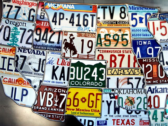
(banner photo by Josh Kellogg — Flickr)
Honorable Mention — U.S. Virgin Islands (7/5/8/8/9, Avg. Score 7.4)

Although the Virgin Islands are obviously not a U.S. state (duh), I had to include this plate. The typeface, which would look silly on any state tag, is perfect here, and I love the fish illustrations. Overall, a very attractive issue that ranks with the best of the continental U.S.
#10 — Oklahoma (6/6/5/7/7, Avg. Score 6.2)

Oklahoma’s long-running white plate with green numbers motif received a major overhaul in 2009, when this design debuted. The new plate features a red, white, and blue color scheme and a picture of Allan Houser’s “Sacred Rain Arrow” sculpture. Very strong.
#8 (tie) — North Carolina (6/6/6/7/7) & Vermont (6/5/9/5/7) (Avg. Score 6.4)


Two very different designs tie for eighth place. North Carolina’s plate features a simple but effective silhouette featuring the Wright Brothers’ famous plane, along with the state name represented with a funky font choice. Vermont’s plate scores on the strength of its simple but appealing white-on-green color scheme. The tree in the upper left corner is too small to have much impact, though.
#7 — Nebraska (6/5/6.5/7/8, Avg. Score 6.5)

This spot was occupied by Kansas when I first ran it, but their 2008 update — replacing the Topeka capitol building with a portion of the Kansas state seal — was a huge downgrade. I was going to replace it with Mississippi, but their excellent lighthouse design was very recently changed for the worse as well. So the new #7 is Kansas’ neighbor to the north — Nebraska.
The previous Nebraska plate issue featured a hideous typeface right out of the Cornhuskers football program, but this new design is much more dignified and appealing. Not even the clumsy inclusion of the state website URL is enough to weigh down an otherwise excellent look featuring the state bird (Western Meadowlark) and flower (goldenrod).
#5 (tie) — Arizona (7/5/7/7/7) & New Mexico (6/5/8/6/8) (Avg. Score 6.6)


A pair of southwest neighbors kick off the Top 5. I really dug the previous Arizona entry (the stark red and white one) but the new one has its charm as well. The clean font and desert scene are very nice. When I originally published this list New Mexico’s plate was a red and yellow color scheme with a hot air balloon. I gave it points for boldness, if not for design. This latest design, which celebrates the state’s centennial, is a legitimately strong design.
#3 — Rhode Island (7/5/7/7/8) (Avg. Score 6.8)

This was originally a tie between Rhode Island and New York, but the latter dropped out thanks to their 2009 redesign. Rhode Island’s plate, which debuted in late 1996, replaced a rather uninspired design. The current one retains the anchor design element, and adds a very nice stylized ocean wave. The muted color scheme is very good, and the font is strong.
#2 — Alaska (7/5/10/5/10, Avg. Score 7.4)

This is not a plate most of us in the Lower 48 see very often, which is a shame. The basic design elements on this one have been in place since 1971, with some variations and interruptions. Other than the “Alaska” font, this plate is decidedly old school, which I love. The color scheme and overall appearance get the only top marks of any plate. The blue-on-yellow scheme is striking. The only thing keeping this entry from the top spot is the uninspired inclusion of the state flag and nickname.
#1 — Colorado (9/n.a./8/8/9, Avg. Score 8.5)

Just as with the Vermont plate, Colorado’s green & white color scheme is a huge plus. The long-used mountain theme is simple but effective, and the font used for the state name is excellent. Less is definitely more here. Not much else to say!
For more information on state plates, check out 15q.net and The License Plate Shack.
anonymous
obviously you haven’t seen the NEW new york license plates… those things are hideous