Logo Evolution: Taco Bell
Taco Bell was founded in 1962 by Glen Bell, who had owned hot dog stands and other taco stands as far back as 1946. The first Taco-Tia stands opened in the early ’50s and were the forerunner of Taco Bell. The first Taco Bell opened in Downey, California on March 21, 1962, and today the franchise boasts over 7,000 locations.
As with any of my other logo capsules, dates may not be totally accurate. As is often the case with logos, older logos can stick around in advertising and building design for a while after their official expiration dates.
1962-72


The original Taco Bell logo design had two separate elements — there was a colorful, blocky wordmark and a festive sombrero/bell sign. This was in widespread use for the first decade of Taco Bell’s existence. Despite its first use in the 1960s, the original Taco Bell retains a decidedly 1950s aesthetic. It’s the most fun logo the company used, although lacking any kind of sophistication.
Here’s a great example of the logo (albeit in black and white) along with some other imagery that would probably not fly today, from a 1968 newspaper ad:
1972-1985
Taco Bell flew headlong into the earth tones of the 1970s with this update. Not much to say about this one.
1984-1994
Hmm, now I can’t decide if the original logo is my favorite or if this one is. Anyway, the intent of this redesign was to help the chain become more mainstream yet not become so Americanized as to lose its ethnic identity. Another part of this marketing blitz involved a glassware giveaway tie-in with Star Trek III: The Search for Spock, as Burger King had done with Star Wars movies in previous years.
1992-1994
The 1990s finally came to Taco Bell with this logo, which was rolled out around 1992 and used, among other places, on the chain’s Taco Bell at Home line of prepackaged foods. It also was a sneak preview of things to come.
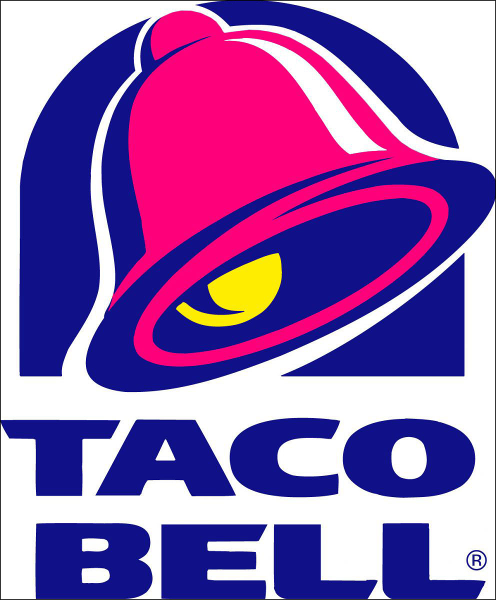
1995-2016
Yeah, not feeling this one. Never liked it or the color scheme at all.
2016-present
The newest Taco Bell logo was unveiled to coincide with the opening of its flagship restaurant in Las Vegas. Which is kind of strange when you think about it, as this logo is minimalist in the extreme and not loud or gaudy at all. Let’s just say I don’t care for it any more than the previous one. Oh well, that’s progress I suppose.


Edward Wysocki
But why a bell??????