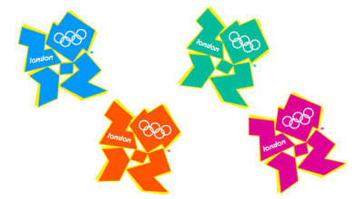
London’s 2012 Olympic logo is awesome

Blimey, that sucks!
And by awesome I mean craptacular. Seriously, did they even try? They’ve had two years to put this together, and it looks like something my six-year-old nephew could put together in Microsoft Paint with a blindfold on. Ooooh, it says 2012 if you look closely! OMG!!@@#! (Actually, it looks like Lisa Simpson giving something that rhymes with ‘snow job’.)
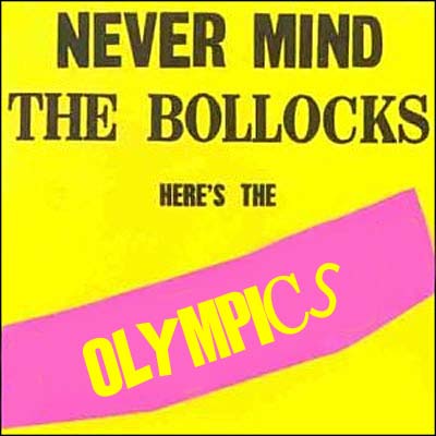
Seriously, I think London really dropped the ball on this one. What they needed to do was to create something more appealing and lasting — something that speaks to the rich heritage of Great Britain, as well as its many contributions to world culture. Since it’s not too late for them to change their minds, I’ve come up with a few ideas (with all respect to my readers from across the Pond, of course).

Classy!

Bawdy!

Cheeky!
I just hope the royalty checks (or cheques, as they say over there) get sent to the right address.

mizerychik
2112 would be better.