
Posters of the WPA
 Back in the day (1935 to be precise), President Franklin D. Roosevelt created the Works Progress Administration (WPA), an enormous government program aimed at providing employment for millions of Americans affected by the Great Depression.
The legacy of the WPA is a host of public works (bridges, roads, etc.) and cultural projects. That’s all well and good obviously, but what I really care about are the cool posters designed to promote many of the WPA’s programs.
All of these images and hundreds more are available as part of the Library of Congress’s “Posters of the WPA” collection. I’ve simply picked what I feel are some of the most visually appealing and added my usual pithy commentary. As you’ll see, these great images are very much of their time and most display an Art Deco sensibility that I love (at least that’s what I think the style is).
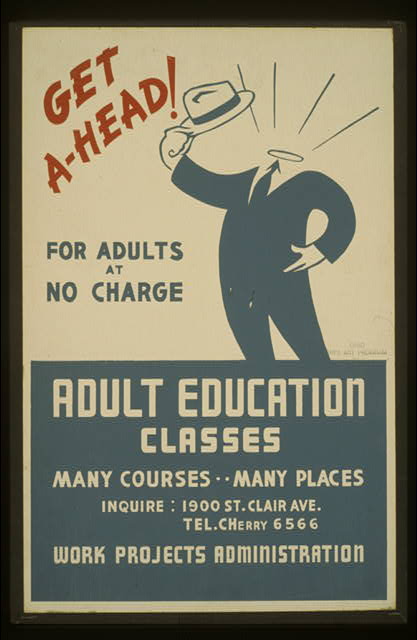
This promo for adult education classes in Ohio is so delightfully absurd, it’s hard to believe it came from a government program. — “Get A-Head!” (artist unknown), c. 1936-1941
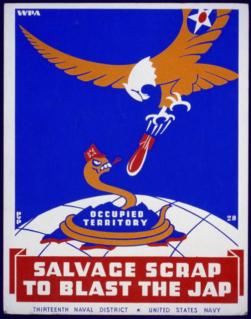
For those not familiar with war propaganda of days gone by, this is typical of many images from World War II (and World War I for that matter). In order to convey just how evil the enemy was, racial stereotypes and slurs were often employed. I’m not sure what the implied threat is here, however, as “the Jap” seems to have conquered the relatively unimportant North Pole. — “Salvage Scrap to Blast the Jap” by Phil von Phul, c. 1940-41

I have no idea if the Sioux City Camera Club’s exhibition was any good, but their poster definitely is great. — Sioux City Camera Club exhibition (artist unknown), c. 1936-39.

Relatively speaking, automobiles were fairly new in the 1930s. Even so, I sincerely hope that drivers did not have to be specifically instructed to not kill animals with their cars. As sad as that may be, this is a very eye-catching, albeit ominous, poster. — “Don’t Kill Out Wild Life” by John Wagner, c. 1936-40
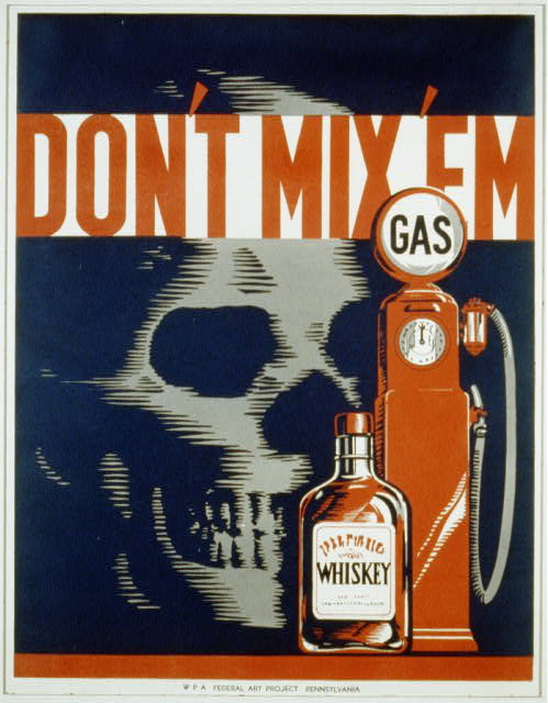
One thing I’m sure of is that it probably took all of three days after the first car rolled out before some jackass decided to get plastered and go for a ride. So it makes sense for this anti-drunk driving ad to warn against that. Or against putting whiskey in your gas tank. No, I’m pretty sure this is about drinking and driving. I do dig the vintage gas pump. — “Don’t Mix ‘Em” (artist unknown), c. 1936-37
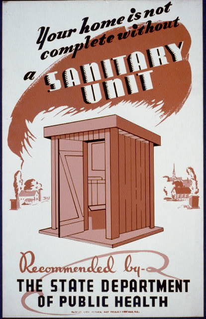
I’ve heard them called outhouses, crappers, and dunnys, but I’ve never heard them called “sanitary units.” Nevertheless, my home does feel incomplete without one. — “Your Home Is Not Complete Without a Sanitary Unit” (artist unknown), c. 1936-41

In the dark days before television and video games, children apparently read for pleasure. I know, sick. Still, the minimalist design and nice blue/black/orange color scheme does make the prospect more appealing. — “October’s ‘Bright Blue Weather’ — A Good Time to Read!” by Albert M. Bender, c. 1936-40

Part of what makes a lot of the imagery of this period so striking is the abundance of clean lines and basic shapes. Looking at this poster I not only feel I should keep my teeth clean, but that it is my duty as a citizen to do so. After all, the Nazis are looming on the horizon and you can’t fight them if you’re gumming K-rations. — “Keep Your Teeth Clean” (artist unknown), c. 1936-38
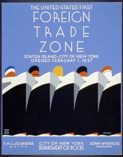
Another design element found in images of this time period is the repetition of a single object. But the same clean design applies to this deceptively simple poster. That font is also something I’d love to see more of. — “Foreign Trade Zone” by Jack Rivolta, 1937
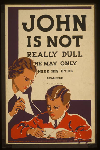
Or he may just be dull after all. On the upside, he is a snappy dresser. — “John Is Not Really Dull” (artist unknown), c. 1936-37.
Related articles
- Works Progress Administration mural will make Cedar Rapids’ new council chambers a treat to visit (thegazette.com)
- How has the Great Depression affected the way unemployment is being deal with today? (unemploy.wordpress.com)
- Appalachian History ” The Pack Horse Librarians (appalachianhistory.net)
People found this post by searching for:
- "works progress administration posters", "poster on adult education", "Suits losmovies com"

nike dunk
Very vivid appearance, perfect plot, challenging game. Many of us put this game as a very important part of life. Surprise,when I browse the web ,I found these website Pretty good.tonesite.net