Retrotisements: Halloween (1978) U.S. and Foreign Movie Posters

This piece originally ran in October 2008. I’ve republished it because, really, this should run annually. But to show I’m not just being lazy, I’ve added posters from Denmark and Italy below!
October 25 marks a momentous day in horror history — the 30th anniversary of the release of John Carpenter’s slasher classic Halloween. While it certainly wasn’t the first horror film on the block, it is one of the best and most influential. I and many other fans of classic horror consider it to be part of the holy trinity of the genre, alongside Friday the 13th (1980) and A Nightmare on Elm Street (1984).
In retrospect, it seems like such a simple concept that it’s hard to believe it hadn’t been fully explored before. A psychopath is on the loose in the streets of a quiet, suburban town (Haddonfield, Illinois) and strikes during the most sinister day of the year… Tax Day! No, actually it’s Halloween.
Director and co-writer Carpenter took a $325,000 budget and spun a cinematic tale that relied as much on an atmosphere of dread and anticipation as on outright violence (and even that violence is tame compared to today’s standards). Contributing to this atmosphere was Carpenter’s iconic score, played pretty much entirely on piano and synthesizer.
After a slow start at the box office, Halloween picked up steam and eventually grossed about $55 million worldwide, catapulting Carpenter and star Jamie Lee Curtis into the big time. The film and its numerous sequels also gave the inimitable Donald Pleasence steady work for the ensuing 15 or 16 years until his death. The original film was re-imagined by Rob Zombie in 2007, but I don’t want to talk about that. I want to talk about the marketing campaign for the ’78 classic.
Those familiar with the movie probably recognize this image — it’s the main promotional poster used in the U.S., and was designed by Bob Gleason (who went on to create the artwork for Halloween II and III.)
United States

Pretty effective if you ask me, even with the rather prominent veins on the back of the hand. Is that some kind of common trait with serial killers?
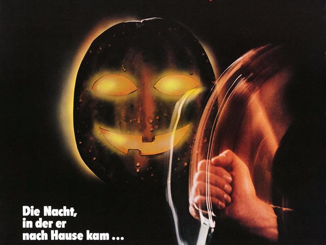
West Germany

Ah! Germans!
Seriously, leave it to our Teutonic friends to take a scary concept and make it even weirder. I’m not sure if that’s supposed to be a jack o’ lantern or that weird mask thing from Super Mario Bros. 3. Anyway, the subtitles translate to “The Night of Horrors” and “The night he came home.” The knife is downsized from the American version and looks more like a switchblade here.
France

Here’s the French poster, in case you couldn’t tell. Pretty much a straight lift from the American, other than the translation of the title to La Nuit des Masques, or The Night of Masks. Ooh la la!
Belgium
The Belgian poster is pretty much the same as the French one with the addition of the subtitle, which translates roughly as “The Night of the Creeps.”
Japan

Forget what I said about that West German poster — the Japanese trump them for sheer weirdness. Witness Michael Myers, who appears to have traded in his trademark William Shatner mask for a Dr. Zaius model. Or maybe it’s supposed to be a simian Mr. Roboto motif.
Sweden

Boy, the Swedes don’t mess around to they? Instead of going the typical horror movie poster route of showing a frightened teen, they slap on a picture of Lynda (P.J. Soles) post-murder. And we get the return of the super vein-bulge hand from the American poster.
Spanish language

“‘Cause he’s once…twice…three times a killer… “
Ah, the good old cut ‘n’ paste technique finally makes an appearance, courtesy of this Spanish-language poster for La Noche de Halloween (The Night of Halloween). Jamie Lee Curtis is understandably mortified at the clumsiness of this design.
Great Britain/Australia

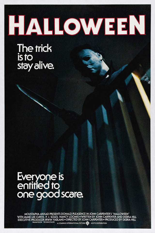
This British/Australian entry takes the lazy way out and simply uses a frame from the movie. But they do add an original touch with the “The trick is to stay alive” and “Everyone is entitled to one good scare” taglines. Struth!

I’m pretty certain this one is also British/Australian, as it has the same tagline as the previous poster. Then again it does share a font with the Spanish-language one above, so it’s not entirely clear. Again, we get a scene from the movie, but taken out of context it looks for all the world like Michael Myers has the ability to project some sort of killer light beam from his hands.
Yugoslavia

And here we have another take on the killer light beam motif. This one seems a little more artful than the Australian take above, although it leaves you with even less of an idea of what the film’s about. I do like that jagged film title font.
Denmark

I like this one. It has a decidedly ’70s feel, in terms of the quality of the illustration. Really makes Halloween seem more tied to that decade than we think of it now.
Italy

Nothing special here, but it’s accurate at least.
Anyway, for the last entry let’s enter the realm of moving pictures and check out the original 1978 movie trailer (or at least until the YouTube Censorship Squad kills the link):
