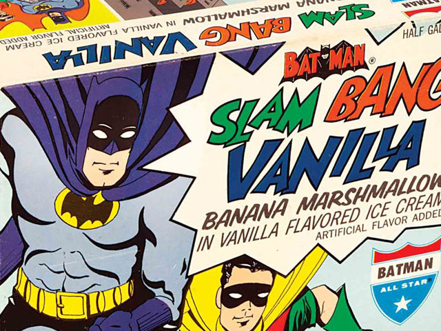
Holy Slam Bang Vanilla Ice Cream, Batman!

Riding the wave of popularity brought about by the Batman television show, DC Comics took the opportunity to cash in on the Caped Crusader’s new fan base. One of the more interesting Batman and Robin artifacts from that era was All Star’s Slam Bang Vanilla Ice Cream from 1966. Here are a few outstanding pieces of ephemera related to the ice cream — a well-preserved product box and a large paper ad.

Note that at this point the official corporate name for DC was still National Periodical Publications, Inc.

Batman & Robin Slam Bang Vanilla Ice Cream (All Star Ice Cream, 1966) Batman & Robin Slam Bang Vanilla Ice Cream (All Star Ice Cream, 1966)

For more auction finds, click here.

Albany, New York street signs (1948)

Vintage Photo Wednesday, Vol. 28: Albany Street Ads, 1948

While looking for material for a possible St. Patrick’s Day theme post, I found this outstanding vintage photograph taken in Albany, New York on August 31, 1948. I don’t know the local street name, but it appears to be in a downtown area where state routes 32 and 9W run nearby. I can just make out an actual street sign name in front of the Phillips Hardware sign, but can’t tell what it says. Any idea?

There are so many great things to look at here I don’t know where to begin, but I suppose I’ll start with one of the biggest items in the picture — the billboard for Beverwyck Beer & Ale, which makes the oddly specific claim of being the “first truly great beer and ale in 8 years!”

(Click the image for a larger version.)

Albany, New York street signs (1948)

Long-time Albany residents should know the Beverwyck name well. Not only is the original spelling for the word — Beverwijck — tied intimately to the city’s history, it also became lent its name to the brewing company that started in 1878. Beverwyck produced many varieties of beer for almost a century, including the ale and Irish cream ale seen in the billboard, until they were closed by parent company F. & M. Schaefer in 1972.

As for the rest of the photo — there’s a car of undetermined make in the lower right, streetcar tracks going down the cobblestone street, and an almost countless assortment of outstanding signage. What makes it even better is the abundance of neon. This street must have looked amazing at night!

If anyone reading this is from Albany or is up on their Albany history, I’d love to know more about the sights in this photo. Anything about the businesses or the general culture and climate (not the temperature kind) of Post-War Albany would be most appreciated.

The Evolution of Fast Food Logos: Top 10 Burger Chains Edition

I know I’m certainly not the first person on the internet to post a gallery showing the history of fast food logos. But I’ll be honest — a lot of the other ones I’ve seen have been half-hearted at best, completely lazy and misleading at worst. So here’s my attempt to remedy that. Here is my turn at a gallery showing the evolution of fast food logos, featuring the top ten largest chains in America (measured by number of locations in 2010).

Dates on some of these logos are estimated, as exact years are difficult to come by for some. If anyone has higher-resolution versions please let me know.

#1. McDonald’s (est. 1940)

The restaurant that became McDonald’s was started in 1937 in Monrovia, California by Patrick J. McDonald, and sold burgers and orange juice. In 1940 his sons Maurice and Richard (Mac and Dick) took it over, moved the building to San Bernadino, California, and renamed it as  McDonald’s Famous Barbecue.

McDonald's Famous Barbecue

McDonald’s Famous Barbecue logo (1940 – 1948)

Eventually the brothers figured out that their most profitable item was the hamburger, so they dropped BBQ from the menu, converted from a carhop stand into a self-service restaurant, and re-opened in December 1948 as just McDonald’s (alternately McDonald’s Famous Hamburgers). The tagline for McDonald’s during this period was “Buy ’em by the Bag.” Unfortunately not a lot of great images from this period are available, but this period photo shows the logo in action.

McDonald's Famous Hamburgers logo (1948 - 1953)

McDonald’s Famous Hamburgers logo (1948 – 1953)

It was in 1953 that McDonald’s started opening new restaurants with the franchising model. Since the emphasis for the franchise was on fast service (in addition to the food, of course), McDonald’s created the Speedee mascot. In 1955 the modern McDonald’s era began when Ray Kroc opened his first franchise location in Des Plaines, Illinois. Note that while the arch motif is present at this point, it was not incorporated into the logo and was not a prominent part of the company’s advertising.

McDonald's Speedee logo (1953 - 1962)

McDonald’s Speedee logo (1953 – 1962)

McDonald's Speedee sign and logo (1953 - 1962)

McDonald’s logo (1953 – 1962)

The first version of the classic Golden Arches logo debuted in 1962, and represented the architecture of the early franchises. The roof sloped upward from the back and its side arches appeared to interlock when viewed from certain angles.

McDonald's logo (1962 - 1968)

McDonald’s logo (1962 – 1968)

McDonald's Filet Fish card, 1967

McDonald’s promotional card, 1967

By the late ’60s, McDonald’s was in the process of phasing the physical arches from its restaurant design, and so a similar change was made to the corporate logo. In 1968-69 the roof-line element was dropped, and the logo transformed into the one recognized the world over. There are some color variations to this logo, but the look is the same.

The main corporate variant featured a white word mark and a red background. Typically in advertising and packaging you could see either a black or white wordmark.

McDonald's logo (red background, white lettering)

McDonald’s logo (red background, white lettering)

McDonald's promotional breakfast mugs, c. 1970s

McDonald’s promotional breakfast mugs, c. 1970s

Of course, almost any color combination was possible. Witness this Big Mac bumper sticker from the 1970s, featuring the famous “twoallbeefpattiesspecialsaucelettucecheesepicklesonionsonasesameseedbun” slogan. The logo here is all red.

McDonald's Big Mac bumper sticker (1970s)

McDonald’s Big Mac bumper sticker (1970s)

Starting in the 1990s, McDonald’s rolled out several variations on the Golden Arches for use in its packaging and promotional materials, but the official corporate logo remained unchanged. That all changed in 2003 when the company undertook a drastic campaign to update its marketing and restaurant design. Enter the “I’m Lovin’ It” era.

McDonald's "i'm lovin' it" logo (2003 - 2006)

McDonald’s “i’m lovin’ it” logo (2003 – 2006)

Another variant of this logo, which also jettisoned the McDonald’s name, featured a more matte yellow Golden Arches.

While the “i’m lovin’ it” campaign is still around in one form or another, the phrase was dropped from the official logo in 2006. The replacement, and current, logo trades on the pure brand recognition of the Golden Arches themselves.

McDonald's logo (2006 - present)

McDonald’s logo (2006 – present)

#2. Burger King (est. 1954)

The predecessor to what is now Burger King was founded in 1953 in Jacksonville, Florida, as Insta-Burger King. The original founders and owners, Keith J. Kramer and his wife’s uncle Matthew Burns, opened their first stores around a piece of equipment known as the Insta-Broiler. The Insta-Broiler oven proved so successful at cooking burgers, they required all of their franchises to carry the device.

Pre-1960 Specimens of the Burger King logo are hard to come by. Here’s an extract of one from an early ’60s ad, which as far as I can tell is the same typeface as the original.

Burger King wordmark logo (1954 - 1957)

Burger King wordmark logo (1954 – 1957)

From 1957 comes the first example of the Burger King character. Notice the “Insta” wordmark on his crown, linking him to the original restaurant. (image via Flick user roadsidequest)

Burger King logo (1957)

Burger King logo (1957)

At some point the “Insta” was taken off the king’s crown, and the logo was updated to reflect the prominence of the Whopper sandwich for the chain.  Here’s what just the mascot looks like, taken from a recent bit of retro packaging to celebrate the Whopper’s anniversary.

Burger King mascot (1957 - 1969)

Burger King mascot (1957 – 1969)

And here’s what the full logo looks like as seen in this 1966 print ad.

Burger King print ad (1966)

Burger King print ad (1966)


In 1969 BK introduced the famous “Bun Halves” logo, with a rather interesting typeface. This logo lasted for a quarter century.

Burger King logo (1969 - 1994)

Burger King logo (1969 – 1994)

The company updated the logo in 1994 by streamlining the typeface, but it was otherwise left intact.

Burger King logo (1994 - 1999)

Burger King logo (1994 – 1999)

Five years later Burger King updated their branding, and rolled out a fancy new logo. The current “blue crescent” logo was designed by the New York-based Sterling Group and made its official debut on July 1, 1999. I made my feelings on this change known several years ago. Hint: I don’t like it.

Burger King logo (1999 - present)

Burger King logo (1999 – present)

#3. Wendy’s (est. 1969)

Founded by Dave Thomas in 1969, Wendy’s has been fairly consistent with their branding over the decades. In fact, most of the elements in the chain’s logo were the same until 2013. The first logo already had the well-known Wendy’s wordmark and an illustration inspired by Thomas’s eight-year-old daughter, Melinda Lou “Wendy” Thomas.

Wendy's logo (1969 - 1970)

Wendy’s logo (1969 – 1970)

In 1970 the company slogan, “Quality Is Our Recipe,” was added to the portrait of Wendy, above her head.

Wendy's logo (1970 - 1976)

Wendy’s logo (1970 – 1976)

The first noticeable design change to the Wendy’s logo came in 1976. The drawing of Wendy was flattened and made to look less homemade, and the wordmark for “Old Fashioned Hamburgers” was streamlined somewhat. Additionally, the swirls became separated from the portrait.

Wendy's logo (1976 - 1978)

Wendy’s logo (1976 – 1978)

After just a few years the Wendy’s logo was modified again. A yellow background was added and the circular portrait frame became more oval-shaped.

Wendy's logo (1978 - 1983)

Wendy’s logo (1978 – 1983)

In early ’83, the logo elements were rearranged. Wendy moved to the top of a more square-shaped mark, and the colors for the two wordmark areas reversed. This is by far the company’s longest-lived brand variety at 30 years.

Wendy's logo (1983 - 2013)

Wendy’s logo (1983 – 2013)

In late 2012, Wendy’s introduced the first major change to their logo ever. It’s considerably less old-fashioned, although I’m still not sure if I like it. Wendy looks mostly the same but less like a little girl and more like an unfashionable teenager. I do already hate the lipstick wordmark. Nevertheless, the rollout of this new logo started in February/March 2013.

Wendy's logo (2013 - present)

Wendy’s logo (2013 – present)

#4. Dairy Queen (est. 1940)

Despite being best-known for their ice cream, Dairy Queen is actually one of the larger fast food chains around. The currently operate more than 5,600 stores worldwide. The first Dairy Queen logo was simply the company wordmark on a blue background. Signs at DQ locations also added an image of their signature soft-serve cone. Both can be seen in this 1956 print ad.

Dairy Queen ad (1956) with logo

Dairy Queen ad (1956)

In 1960 the iconic logo rolled out. It featured an updated wordmark on a red ovoid vaguely resembling a pair of lips. This logo remained in use through the rest of the 20th century.

Dairy Queen logo (1960 - 2001)

Dairy Queen logo (1960 – 2001)

After many years of being known colloquially as “DQ,” Dairy Queen changed its name to that in 2001 and issued an updated logo. The wordmark changed but that’s about it. (I believe the difference in shades of red is an artifact of my source files.)

Dairy Queen/DQ logo (2001 - 2006)

Dairy Queen/DQ logo (2001 – 2006)

Another update to the DQ logo was introduced in 2006. It sports a different typeface and italicized letters, as well as arced lines. The lines are meant to represent the chain’s main service offerings (orange to represent its hot foods and blue to represent its ice cream products).

Dairy Queen/DQ logo (2006 - present)

Dairy Queen/DQ logo (2006 – present)

#5. Arby’s (est. 1964)

Since Forrest and Leroy Raffel founded of Arby’s in Boardman, Ohio in 1964, the chain’s logo has had two prominent elements — the wordmark and a big ol’ hat. I couldn’t find any print versions of the first logo, which also featured the slogan “Arby’s Roast Beef Sandwich Is Delicious,” but there are plenty of pictures of the sign bearing it. Many locations still use it today. Here’s a composite image featuring the neon sign in the daytime and all lit up at night.

(Technically, Arby’s is considered a quick-service sandwich chain rather than a fast-food burger chain. But I like the hat, so it goes on my list.)

Arby's sign logo (1964 - 1975)

Arby’s sign logo (1964 – 1975)

In 1975 the logo was streamlined to remove the slogan and turn the hat into a red outline. Simpler but less fun if you ask me.

Arby's logo (1975 - 2012)

Arby’s logo (1975 – 2012)

The latest Arby’s logo debuted in late 2012, and I covered it here. As updates go it’s not totally offensive, but they could have gone in an interesting new direction instead of just making it 3-D.

Arby's logo (2012 - present)

Arby’s logo (2012 – present)

#6. Sonic Drive-In (est. 1953)

Oklahoma City-based Sonic bills itself as “America’s Drive-In,” and indeed is one of the five largest fast food chains in the country. The chain was founded by Troy N. Smith, Sr. after he bought into a walk-up root beer stand called Top Hat. Sales skyrockets after Smith implemented the drive-in model, complete with carhops. The Sonic name was introduced in 1959, and was chosen because it turned out Top Hat — whose slogan was “Service with the Speed of Sound” — was already trademarked.

Here is the first Sonic logo on a neon sign, which is the best way to see these things anyway.

Sonic Drive-In neon sign with original logo

Sonic Drive-In neon sign with original logo

From 1963, here’s a print version of the logo from a piece of food packaging. Not only does it list some of the states Sonic had spread to, but sports a fantastic vintage graphic of a satisfied customer holding a bag of steaming hamburgers. Notice the motion lines on the Sonic wordmark.

Sonic Drive-In logo (1963)

Sonic Drive-In logo (1963)

Here’s an isolated wordmark logo with the “Happy Eating’ tagline.

Sonic Drive-In logo (1974)

Sonic Drive-In logo (1974)

The current, Googie-inspired Sonic logo debuted in 1998, and has been in use since then.

Sonic Drive-In logo (1998 - present)

Sonic Drive-In logo (1998 – present)

#7. Jack in the Box (est. 1951)

Jack in the Box, founded by Robert O. Peterson, was and is still headquartered in San Diego, California. The first location was a converted Oscar’s, Peterson’s previous burger chain. Since the chain had developed a circus motif complete with a clown, the new drive-through focused operation was named Jack in the Box.

For several years through the 1950s and ’60s, Jack in the Box locations featured a number of different logos — all a variation on the basic design of a clown head popping out of a colorful box. If there was a single, unified corporate logo for the chain during this period I couldn’t find it. What I could find were some excellent vintage photos of various Jack in the Box locations. First two photos via Modern San Diego, third via Oak Cliff Yesterday.

Jack in the Box burger location (designed by Russell Forester) circa 1951

circa 1951

The logo on this next one is what I believe to be the one used by Jack in the Box in the ’50s and ’60s.

Jack in the Box burger location, circa 1956

circa 1956

Jack in the Box burger location, circa 1968

circa 1968 (photo by Della Cirillo)

Here’s another variation on the clown look, but with the same typeface.

Jack in the Box promo logo, 1971

circa 1971

In the early ’70s the logo was cleaned up and modernized somewhat. A white wordmark with a new typeface was placed on a red square with rounded corners. Here’s an example taken from a take-out bag from the 1972/73 period.

Jack in the Box logo, early 1970s

circa early 1970s

The next update came about in 1978 and it (temporarily) brought back the clown head, albeit in a stylized form. The “Hamburgers” portion of the wordmark was removed, and the faceless clown sported a hat and three round balls. These presumably were a visual representation of puffy, frilled clown collar.

Jack in the Box logo (1978 - 1980)

Jack in the Box logo (1978 – 1980)

After the short-lived geometric clown design, the next Jack in the Box logo was rolled out in 1980. It most closely resembled the early ’70s variety, but with a more rounded typeface and a tilted red box. Some locations still feature this logo design.

Jack in the Box logo (1980 - 1985, 1986 - 2009)

Jack in the Box logo (1980 – 1985, 1986 – 2009)

And now we get to a strange period in the chain’s history. In 1985 Ralston Purina, who bought Jack in the Box in 1968, completely re-branded the chain. They got a new name — Monterey Jack’s — and of course a new logo. What they didn’t get was new customers, and so the change was reversed in 1986. Good specimens of the Monterey’s Jack’s are really hard to come by, so here’s a screenshot from a TV commercial.

Monterey Jack's (Jack in the Box) logo (1985 - 1986)

Monterey Jack’s (Jack in the Box) logo (1985 – 1986)

After a very public apology for the Monterey Jack’s fiasco, Jack in the Box brought their menu and logo back in 1986. The remained untouched for 23 years, until 2009. That’s when the current version was introduced. The typeface is much more modern (although the swoop in the “k” forming a smile is a nice throwback touch), and the plain red box is now 3-D and in your face.

Jack in the Box logo (2009 - present)

Jack in the Box logo (2009 – present)

#8. Hardee’s (est. 1960)

Hardee’s, which which mostly operates in the South and Midwest regions, was founded by Wilbur Hardee, who opened his first restaurant in Greenville, North Carolina on September 9, 1960. One of the chain’s signature food items early on was the Huskee hamburger.

One of the earliest Hardee’s logos featured a friendly looking chef cooking burgers on an old kettle grill while giving the universal seal of chef approval. Here’s a specimen pulled from a 1962 employee paper hat.

Hardee's logo (1962)

Hardee’s logo (1962)

The first major logo change came about in the early 1970s (I’ve seen varying accounts of the exact year). It was simplified into a stylized H composed of two vertically swooping orange halves with an orange dot in the middle. The Hardee’s wordmark changed from a script typeface to a sans serif one, and can be seen in a fully black or black outline variety. This is one of my favorite fast food logos ever.

Hardee's logo (circa early 1970s)

Hardee’s logo (circa early 1970s)

Here’s a great vintage photo of some Hardee’s product packaging showing the logo.

Hardee's packaging w/logo (1973)

circa 1973

The orange H was dropped from the logo in the late ’70s (I’m guessing ’78 or ’79, but perhaps earlier), and the wordmark was further stylized. This new logo was often depicted in orange on a blue or brown background. Here’s a sample from a storefront sign. This design lasted until 1999.

Hardee's logo (1970s - 1999)

Hardee’s logo (1970s – 1999)

After Hardee’s was bought out by Carl’s Jr. in 1999, they adopted their new parent company’s smiling star logo. The typeface was changed once again (to something resembling Courier), and the overall color scheme converted to bright red and yellow.

Hardee's logo (1999 - 2006)

Hardee’s logo (1999 – 2006)

In 2006, both Hardee’s and Carl’s Jr. received a substantial “fancification.” The typeface converted to an embossed script, and the whole logo was given a bubbly red background. The Hardee’s version was also given the tagline “Charbroiled Thickburgers.”

Hardee's logo (2006 - present)

Hardee’s logo (2006 – present)

#9. Carl’s Jr. (est. 1941)

Speaking of the aforementioned Carl’s Jr., it was founded by Carl Karcher and his wife Margaret. The Karchers started their first business, a hot dog stand, on July 17, 1941 in Los Angeles, California when they borrowed $311 against their Plymouth automobile and added $15 from Margaret’s purse. The stand initially sold hot dogs and Mexican tamales. On January 16, 1945, they opened their first restaurant, Carl’s Drive-In Barbecue, in Anaheim, California. The first Carl’s Jr. restaurants opened in 1956.

The Carl’s Jr. logo has always featured a star in one form or another. According to an old trademark application I found it was a plain star as early as 1945, was updated around 1954, and turned into the form you see here by no later than 1963.

Carl's Jr. logo (1956 - 1985)

Carl’s Jr. logo (1956 – 1985)

Here’s photo of the logo in usage at a Carl’s Jr. location in 1978. The tagline at this time was “Char-Broiled Hamburgers.”

Carl's Jr. sign logo (1978)

Carl’s Jr. sign logo (1978)

Here’s an interesting variant on the star, used to sell Mexican food through the new Taco de Carlos spinoff chain (launched 1972). The star is now holding a taco and wearing a sombrero. The concept never really took hold, and was gone by the early ’80s.

Taco de Carlos logo (1972)

Taco de Carlos logo (1972)

The next major logo redesign was introduced in 1985, and remained in place for more than 20 years. The star lost his burger and drink cup, and the Carl’s Jr. wordmark moved to a red Courier-type font.

Carl's Jr. logo (1985 - 2006)

Carl’s Jr. logo (1985 – 2006)

In 2006 the same update that Hardee’s received was given to Carl’s Jr. as well. That means a star with beveled edges, a script wordmark, and a bubbly red background.

Carl's Jr. logo (2006 - present)

Carl’s Jr. logo (2006 – present)

#10. Checkers/Rally’s (est. 1986/1985)

Checkers and Rally’s were founded within a year of each other and both focused much more on drive-through service than on in-house dining. The main difference was location — Rally’s served the Midwest and Checkers the Southeast.

As far as I can tell, there has only been one primary logo used by Checkers since their debut in 1986. It features a white wordmark on a red background, with BURGERS FRIES COLA on a yellow background. Both of these elements are separated by a horizontal, black-and-white checkerboard band.

Checkers logo (1986 - present)

Checkers logo (1986 – present)

The original Rally’s logo featured a smiling man wearing old-fashioned racing gear (scarf, cap, etc.) and holding a hamburger. Here’s a sample of the logo in the intended red, on a t-shirt.

Rally's Hamburgers logo (1985)

Rally’s Hamburgers logo (1985)

At some point in the chain’s history they used this next logo as well. It calls to mind a stop sign that’s been stretched horizontally, which is an odd look since you wouldn’t want to tell your customers to stop eating your food (even subliminally). If someone knows the dates for this logo’s usage I’d love to know.

Rally's Hamburgers logo (date unknown)

Rally’s Hamburgers logo (date unknown)

When Rally’s merged with Checkers in 1999, they adopted the Checkers logo design and changed their restaurant design to match Checkers’ as well.

Rally's logo (1999 - present)

Rally’s logo (1999 – present)

People found this post by searching for:

    "Hardees", "mcdonalds logo", "rallys", "fast food logos", "checkers", "hardees logo", "هارديز", "hardees restaurant"
Plymouth Fury 1968 billboard ad

Ads from the Open Road, Volume 1

I don’t really pay much attention to billboard advertisements while I’m driving, unless it’s something fairly snappy or unique. And as much as I’d like to romanticize old billboard ads, I think the medium as a whole has been fairly bereft of great ideas. And if you think about it, it makes sense.

You’re only going to see a billboard ad clearly for what, four or five seconds? So it’s all about economy of ideas and design. Anything too complicated and you either lose a driver’s interest or cause a 20-car pileup. Neither is good for business.

I’m not holding this group of classic billboard ads up as the best ever, but I think you’ll enjoy them nonetheless. These are all courtesy the Duke University Libraries Digital Collections advertising series.


RCA (Whitey's TV) 1969 billboard advertisement

I can’t decide which part of this ’69 RCA billboard I love the most.


Anti-Ayatollah Khomeini billboard (1980)

Sammy Hagar clearly does not approve of this gem from 1980, aimed at Iran’s Ayatollah Khomeini.


Plymouth Fury 1968 billboard ad

I like the shape of this 1968 Plymouth Fury ad. It’s a nice change from plain old rectangular. And I love that they used the Plymouth font for the tagline too.

Read More

Old and new Arby's logos

Let’s Talk About the New Wendy’s and Arby’s Logos

This fall has seen a few major changes on the fast food logo front. Venerable chains Wendy’s and Arby’s both made significant changes to their branding for the first time in decades. While the basic visuals were kept intact, the looks have very much changed. Let’s look at the changes in alphabetical order.

Old and new Arby's logos

(image via StockLogos)

So what’s really changed here is the move from 2D to 3D, and yet another corporation moving to a sans serif typeface. Oh and then there’s the new apostrophe, which is supposed to look like something I guess.

It’s not an offensive change, but I don’t really think it’s an effective one either. I can understand with those who found the prior logo a little old-fashioned, but there’s the right way to modernize and the wrong way. First of all, can we stop with the sans serif already? You sell cheap roast beef sandwiches, there’s no way to make that look slick.

And again, what the hell is that apostrophe thing supposed to be?

I’m giving this change a C-.

Old and new Wendy's logos

(image via WISH-TV)

Well now this is interesting. Another old-fashioned, Western themes logo is jettisoned for something cleaner and just a bit blander. I’ll definitely miss the big block of red and white and the old font, but I’m a realist and I understand why it may not work for them in 2012. It was the most complex logo, relatively speaking, of the Big 3 burger chains. As for the new typeface, I’m going to need some more time to think about it before I render a judgment.

Now about Wendy. I guess she had to grow up some time, right? But now it looks a little creepy, like a 30-something that shows up to Burger-Con for some fast food cosplay. It’s a little off-putting to be honest.

I’ll give this a B- for now, but I reserve the right to adjust later. While I’m thinking about it I’ll re-watch the classic Wendy’s “Grill Skills” training video.

Fisher-Price’s TV Commercials Make Me Miss Being Childless

Being the parent of a toddler, I get to watch a wide range of children’s TV. Some of it is actually pretty good, and some of it stinks. And then of course, there are the commercials. Tons and tons of commercials. For the most part I’m able to tune them out, or even have some fun with the ads.

But not the latest batch of Fisher-Price spots. Let’s see if you can guess why, with this example.

Seems pretty harmless, right? The kid’s cute, and who doesn’t love toys? I mean, yeah, that song is a little annoying, what with the singer sounding like someone drugged her water before the recording session. But I guess she’s not that obnoxious.

Now try sitting through about 100 of these ads. That whiny, droning indie hipster “singing” transforms from slightly grating to completely rage-inducing. The only thing missing from this treacly garbage is the ever-present ukulele. If Zooey Deschanel had kids she’d be singing this, I just know it.

Gah! I need to watch something vintage to cleanse the bile out of my system. Ah, this vintage Little People ad should do the trick.

RIP Hostess and Twinkie the Kid

Could this be the end of the line for Hostess and its many iconic brands? Having already emerged from bankruptcy in 2004, it looks like a second filing and an employee strike will finally do them in. I really don’t eat any of their stuff anymore, but it’s still a damn shame. Here’s a partial list of Hostess brands as of 2012:

  • Baker’s Inn
  • Beefsteak
  • Blue Ribbon
  • Butternut Breads
  • Colombo
  • Cotton’s
  • Drake’s
  • Dolly Madison
  • Dutch Hearth
  • Eddy’s
  • Good Hearth
  • Home Pride
  • Hostess
  • Nature’s Pride
  • Toscana
  • Wonder Bread

Sigh. Oh well, life goes on I guess. But before we say our final goodbyes, let’s look at this neat old Hostess ad from 1956, featuring their cup cakes, Sno-Balls, and of course Twinkies.

Hostess snack foods ad (1956)

Vintage Burger King logo (1950s/1960s)

Vintage Burger King Logos Help Celebrate the Anniversary of the Whopper

Unbeknownst to me until last weekend, Burger King is raising a big fuss to celebrate the 55th year of its Whopper sandwich. I’ve been known to patronize their restaurant from time to time, so imagine my delight when I saw that they’re splashing their old logos all over their food packaging. Below are scans I took recently, featuring vintage Burger King logos of the past:

Vintage Burger King logo (1950s/1960s)

This is the original Burger King logo, and dates from the around very beginning of the franchise — once known as Insta-Burger King — in 1955 all the way through the 1960s. You can get a larger version here.

Vintage Burger King logo (1970s)

Here’s the next version of the mascot — apparently also known as Kurger Bing according to Wikipedia — which debuted in 1971. He lasted until the late ’70s, when he was replaced by the more realistic-looking Marvelous Magical Burger King, who ruled over the Burger King Kingdom. The larger version of this is here. Sorry for the imperfections in the middle — this was scanned from a bag.

People found this post by searching for:

    "burger logo", "logo burger", "VintageBurgerKingLogosHelpCelebratetheAnniversaryoftheWhopper|grayflannelsuit net", "burger king 1971", "king logo", "vintage 70s burger king"
Coca-Cola ad (Ebony magazine - August 1967)

Coca-Cola’s Contribution to the Civil Rights Movement of the ’60s

And now for a little advertising history lesson…

The year was 1967, and the American Civil Rights Movement was at its zenith. After years of struggle to seek equality in the United States, African-Americans had won a series of stunning legal and moral victories. What they had not yet won, apparently, was the right to not be imitated by white people in advertising.

Huh?

Let me set the stage first. Here’s an ad for Coca-Cola that ran in the August 18 issue of Life magazine:

Coca-Cola ad (Life magazine - August 18, 1967)

By the way, that’s a pull tab that guy is using to open the can. I know, barbaric.

OK, so what’s the problem you ask? Well, usually when a company wants to sell their product to different racial or ethnic groups, they use people from those groups. Like these Coke ads from black magazines in the same year:

Coca-Cola ad (Jet magazine - November 9, 1967)

Coca-Cola ad (Ebony magazine - April 1967) feat. Carmen De Lavallade

But apparently there was a severe shortage of African Americans with the ability to open pull tab cans in ’67, because Coca-Cola ran this ad in the August issue of Ebony magazine:

Coca-Cola ad (Ebony magazine - August 1967)

Notice anything familiar? You should, because that’s the exact same hand in both ads. Coke simply darkened through airbrushing (or whatever the 1960s equivalent of Photoshop was) the photo of the white hand to make it look black. Take a close look at the fingernails to be sure – they’re from exactly the same hand, unless two different people miraculously manicure their nails in the same fashion.

So was this just a harmless example of cost-cutting in Coke’s marketing department? Or did Coca-Cola just secretly hate black people? Well, far be it from me to wildly speculate, but I’m going to go with the hating black people thing. That seems plausible.

People found this post by searching for:

    "advertisements in magazines"