The Best and Worst Major League Baseball Logos (AL East)
With the 2012 Major League Baseball season nearly upon us, now is as good a time as any to obsess once again on one of my favorite topics — logos. So I’m going to offer up my choices for the best and worst team logos for all 30 current MLB franchises. Primary, alternate, and cap logos listed on Chris Creamer’s outstanding logo website are all under consideration. Today I look at the five squads of the American League’s East division.
(Other recaps — AL West, NL West, AL Central, NL Central)
Baltimore Orioles
Best

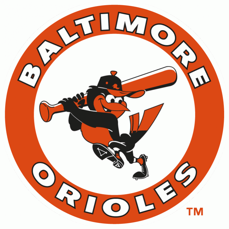
Despite being a lifelong Yankees fan, I’ve always been partial to the Orioles. Could it be because orange is in fact my favorite color? Maybe. All I know is that this logo, the team’s second, is damn neat. It’s fun but not frivolous, cartoonish but not cutesy. This one, used until the early ’90s, just edges out the Orioles’ original logo as their best.
Worst

It seems a lot of people favor this alternate logo, which the O’s rolled out in 2009. I am not one of them. Yeah the Maryland state flag design is cool, but the way it’s just lazily shoehorned into the old Baltimore logo leaves me cold. I’ll take any of the team’s ornithologically correct (but bland) logos over this one.
Boston Red Sox
Best

Until I undertook this project, I never really gave much thought to the fact that the primary logo the Red Sox used from the late ’70s until 2008 used two totally different typefaces. Now that I have this alternate, more uniform version in front of me, it just looks so much better. I’ll despise the Sawx until they lower me into the ground, but this is one of the best logos in sports.
Worst

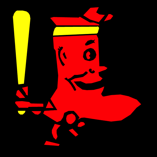
On the other hand, this thing is an abomination. I don’t know what kind of drugs were available in 1950 — when this was introduced — but somebody got some and decided it would be swell to combine the red sock imagery with the shape of Massachusetts. What resulted instead was a decade of nightmare fuel.
New York Yankees
Best

Two things make this an easy choice. One, the Yankees have only used two primary logos in their history, of which this is the second (introduced in 1947). Two, it kicks ass.
Worst

I know I said in previous entries of this series that I don’t like to rag on early 20th century logos because everything looked weird back then, but I really didn’t have a choice here. Again, two primary logos in Yankees history. So this is the one used by the Yankees in 1905, when they were still known as the New York Highlanders. You can see what they were going for here, but they didn’t really hit the mark.
Tampa Bay Rays
Best

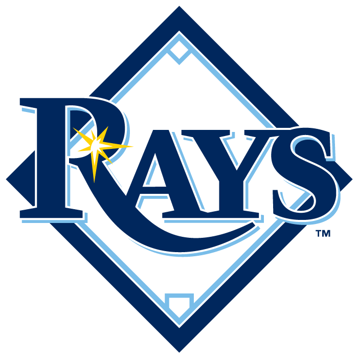
So now we move from a franchise with a rich, storied past to one with virtually no past. I had to disqualify the Devil Rays’ first logo because using a color gradient was a bad idea. This is cleaner, albeit less interesting. Still, it gets the job done. The typeface is not without merit too.
Worst

Has it really been four years since Tampa pulled the gutless move of removing the word “devil” from their name and ditched the devil ray symbolism altogether? Lovely. So what is this new logo and name supposed to represent? Well, in the words of majority owner Stuart Sternberg it represents, “a beacon that radiates throughout Tampa Bay and across the entire state of Florida.”
Fail.
Toronto Blue Jays
Best

I was a big baseball card collector for about five years, starting around 1983. I always enjoyed seeing Blue Jays cards pop up and looking at this logo and those old uniforms. I always loved the color scheme, the logo itself, and especially that typeface (which was retro and modern at the same time). There can be no question that this specimen, used from the team’s debut season of 1977 through 1996, is their all-time best.
Worst

I have vague memories of an old Woody Woodpecker episode where either Woody or some other bird becomes all huge and muscular. I don’t remember if it was a drug of some sort or the result of an intense workout regimen, but it probably was the drugs. Body-altering serums were big in cartoons back in the day. Anyway, it creeped me out as a kid and this creeps me out as an adult. Fortunately this was canned after 2003, with just one season as Toronto’s primary logo.
People found this post by searching for:
- "baltimore orioles", "baltimore orioles logo", "new york yankees logo", "orioles logo", "baltimore orioles logo 2012", "blue jays logo", "ny yankees logo", "boston red sox logo"