The Best and Worst Major League Baseball Logos (AL West)
With the 2012 Major League Baseball season nearly upon us, now is as good a time as any to obsess once again on one of my favorite topics — logos. So I’m going to offer up my choices for the best and worst team baseball logos for all 30 current MLB franchises. Primary, alternate, and cap logos listed on Chris Creamer’s outstanding logo website are all under consideration. Up first are the four squads of the American League’s West division.
For more logo and sports-related lists and rankings, check out my this handy Sports Lists page.
Los Angeles Angels of Anaheim
Best

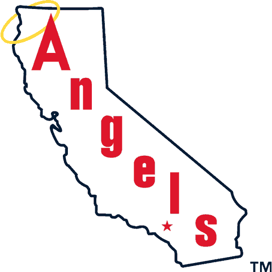
Yeah, using an outline of your home state is a bit of a cop-out but this logo, used from 1973-1985, has a lot going for it. It’s clean and simple but makes good use of the halo. I never cared for any of the Angels logos with wings in them — just seems too predictable. I’m also a fan of the typeface, and the star representing Anaheim is a nice touch.
Worst

See, this is what I’m talking about with the angel wings motif. The “Angels” typeface is pretty good but this looks too minor league for me. Just doesn’t have that classic baseball feel. Also, only the San Diego Chargers can get away with light blue on any of their gear.
Besides, they’ll always be the California Angels to me.
Oakland Athletics
Best

What makes this so great, other than the fact that it’s an angry white elephant holding a baseball, is the reason it exists in the first place. In 1902, one year after the Athletics were founded in Philadelphia, New York Giants manager John McGraw told A’s team owner Connie Mack that his club was a “white elephant.” A white elephant, in case you don’t know what that is, is a term for something that’s really cool and valuable, but costs so much to own that it’s not really worth it.
So as one of the greatest “F*** you” moments in sports history, Mack adopted a white elephant as the team’s logo and proceeded to win the American League pennant that same year. This variation on the logo was used from 1940-1953.
Worst

Oh wow, an elephant wearing sunglasses! With a sun in the background! That’s… great.
Seattle Mariners
Best

Count me as a big fan of the Mariners’ old trident branding, especially this logo (used 1980-1986). I also miss the blue, yellow, and white color scheme.
Worst

Blech. Boring. Z’s is more like it. Not much else to say here. I’m also not a huge fan of the current Seattle logo, but at least it has a stronger identity than this.
Texas Rangers
Best

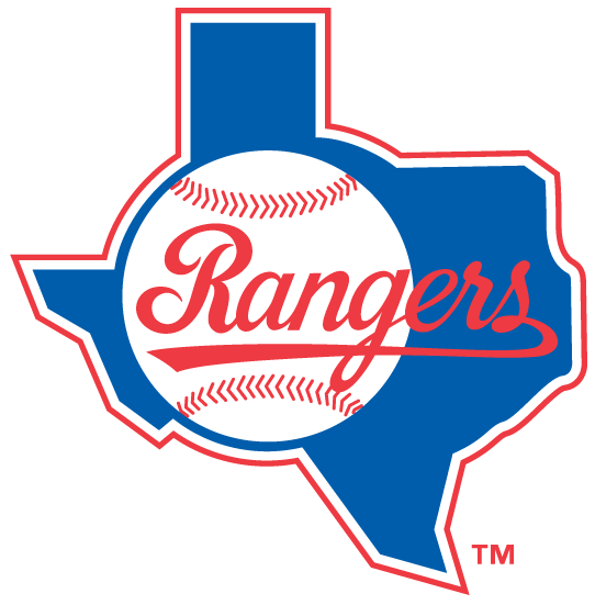
Classic. As with the Angels logo above, this is an exception to the rule about states in logos being a cop-out. Love that script typeface, and the color scheme as well. I wanted to be all cheeky retro and say that the team’s first two logos were better, but that’s simply not true.
Worst

Barf. First, I hate pinstripes in logos. Second, this looks like the logo for a chain of moderately priced business-class hotels. It manages to be distinctive while at the same time lacking in any personality whatsoever. Luckily the Rangers dropped this after the 2002 season.