The Best and Worst NBA Logos (Southeast Division)
I’ve gone through my logo rankings for the NFL and MLB, so now it’s time for the NBA! If you want to see which logos I picked as the best for those leagues, I’ve provided this handy reference page. Otherwise, let’s do some roundball logo reviews. I’m going to take this at an easier pace than I did with football and baseball, so this will be running throughout the NBA 2012-13 regular season.
Up next are the five teams of the Eastern Conference’s Southeast Division — the Atlanta Hawks, Charlotte Bobcats, Miami Heat, Orlando Magic, and Washington Wizards. As always, most of these are sourced from Chris Creamer’s outstanding logo website.
Atlanta Hawks
Best

Atlanta Hawks alternate logo (1970 – 1972)
Alright, so maybe the uniforms the Hawks wore for these two seasons were pretty hideous, even by early ’70s standards. But I like the colors, and it is pretty striking. Note that the more well-known ’80s/’90s Reverse Pac-Man logo was a close second for me.
Worst

Atlanta Hawks alternate logo (2007 – present)
Lots of praise for this thing over on the Sports Logos site, but I don’t get it. This looks half finished to me, and more suited for one of the lesser college football conferences than for an NBA team.
Charlotte Bobcats
Best
The Bobcats have no logos in their brief history that I would declare their “best.” Just different degrees of suckitude. So let’s pick the worst offender.
Worst

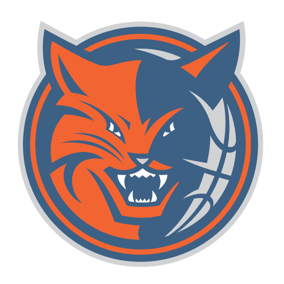
Charlotte Bobcats alternate logo (2007 – 2012)
How is this not a ripoff of the Minnesota Timberwolves logo, but with different colors? Also, VAMPIRE KITTEH!
Miami Heat
Best

Miami Heat logo (1988 – 1999)
The Heat have only had two primary logos — this one and a redesign from 1999. I prefer this one, as it actually makes the basketball seem hot. The new version makes it look all melted.
Worst

Miami Heat alternate logo (1999 – 2006)
Well if this isn’t the logo from some crappy South Beach night club/Mexican chain restaurant I don’t know what is.
Orlando Magic
Best

Orlando Magic logo (1989 – 2000)
Yeah it’s a little cheesy, but this is Orlando we’re talking about. I was struck by this look when the Magic entered the league, and I still think this is a fun logo.
Worst

Orlando Magic logo (2000 – 2010)
This, on the other hand, is just a little too over the top. Even for a town that owes its existence to a giant cartoon mouse. Also, it reminds me way too much of the hated Washington Wizards logos of the past. Speaking of which…
Washington Wizards
Best

Washington Bullets logo (1987 – 1997)
Call them the Baltimore Bullets, Capital Bullets, or the Washington Bullets, it matters not. I loved the uniforms and the logos. But look, I’m a sensitive guy, so I can empathize with ownership wanting to change the name because of the rampant violence in the Washington D.C. area. But still…
Worst

Washington Wizards logo (1997 – 2007)
… this was not the way to make things better. How is this monstrosity not supposed to incite more violence?
spinetingler
I wasn’t an NBA fan in the early early 70s (I was in single digits age-wise) so I didn’t know that those blue/green unis even existed until a few years ago. I’d love to have a Maravich one.