Vintage ephemera: Two for the road
As a long overdue followup to my first gallery of interesting postcards, I present a pair of motels that employ very different advertising techniques to showcase their individual franchise locations. And by different I mean one goes for a colorful and artistic angle, while the other takes about the laziest way out you can imagine. So let’s start with them!
The thing about motels is they almost never look as good in the daylight as they do after a long night of driving. Seen through the bleary eyes of a parent toting a carful of cranky children, anything short of a crack house seems appealing. Why motels in not-quite-picturesque locales continue to ignore this fact is beyond my understanding, but so it is here with the Econo-Travel Motor Hotel in Staunton, Virginia.

Couldn’t they have at least taken the picture without all the barren trees in the background? It’s Virginia, not Calgary – I’m pretty sure the available window for snapping shots of trees with leaves is fairly large there. Not to mention the mostly empty parking lot with that couple by the office hightailing it out of there.
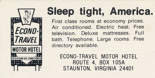
On the plus side, note the classic Scotsman/tartan motif in use here, even on the outside walls. This was the look sported by the chain when it first appeared in 1972. I’m guessing this postcard was taken around then, as the chain started in Virginia. The description on the back of the card pretty much sums up what Econo-Travel was all about:

Free directory??!! When can I check in???
Econo-Travel was sold in 1983 and the new owners adopted the current EconoLodge name that was already being rolled out. Choice Hotels bought the franchise in 1990 and rolled out the less cool new logo in 2008. Incidentally, there is an EconoLodge in Staunton, but I’m not sure it’s the same one.
Up next is a postcard that…well…let’s just take a look. It’s for the Lakewood Motel (part of the Best Western chain) in Mt. Pleasant, Texas:

Wow, now that’s one funky postcard! I just don’t know what else to say about it, so let’s just soak in that ’70s technicolor goodness.
Now this is a pretty visually appealing postcard, wouldn’t you agree? But the sales pitch is an interesting one. The appeal of this particular motel seems to be its role as a gateway to other places you’d rather be. But even then I’m not sure what the angle is. The Grand Canyon is more than 1,000 miles from Mt. Pleasant; while the Ozarks and the Gulf of Mexico are around 300 miles away in opposite directions.
Still, the colors!