Let’s Talk About the New Wendy’s and Arby’s Logos
This fall has seen a few major changes on the fast food logo front. Venerable chains Wendy’s and Arby’s both made significant changes to their branding for the first time in decades. While the basic visuals were kept intact, the looks have very much changed. Let’s look at the changes in alphabetical order.

(image via StockLogos)
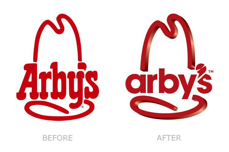
So what’s really changed here is the move from 2D to 3D, and yet another corporation moving to a sans serif typeface. Oh and then there’s the new apostrophe, which is supposed to look like something I guess.
It’s not an offensive change, but I don’t really think it’s an effective one either. I can understand with those who found the prior logo a little old-fashioned, but there’s the right way to modernize and the wrong way. First of all, can we stop with the sans serif already? You sell cheap roast beef sandwiches, there’s no way to make that look slick.
And again, what the hell is that apostrophe thing supposed to be?
I’m giving this change a C-.

(image via WISH-TV)
Well now this is interesting. Another old-fashioned, Western themes logo is jettisoned for something cleaner and just a bit blander. I’ll definitely miss the big block of red and white and the old font, but I’m a realist and I understand why it may not work for them in 2012. It was the most complex logo, relatively speaking, of the Big 3 burger chains. As for the new typeface, I’m going to need some more time to think about it before I render a judgment.
Now about Wendy. I guess she had to grow up some time, right? But now it looks a little creepy, like a 30-something that shows up to Burger-Con for some fast food cosplay. It’s a little off-putting to be honest.
I’ll give this a B- for now, but I reserve the right to adjust later. While I’m thinking about it I’ll re-watch the classic Wendy’s “Grill Skills” training video.
Related articles
- Who’s This Hot Slut in the New Wendy’s Logo? [Wendy’s] (gawker.com)
- New Logos: Arby’s Vs. Wendy’s (slog.thestranger.com)
- Arby’s Goes Bland (underconsideration.com)
Thom
You’re way too generous with the Arby’s logo. That is beyond hideous. The font choice is silly at best and as for the 3D – why just the hat? I guess because they figured why make the whole thing an abomination, but really it looks like someone screwed up in rendering. Which is believable considering it looks like it was rendered by a high school kid who just found a copy of Illustrator 5. This one actually makes me forgive the DQ logo change – LOOK AT WHAT IT COULD HAVE BEEN!!!
As for the Wendy’s – not bad. I think the font choice is a nice compromise between old-fashioned and modern and the overall look is streamlined without being completely bland. But yes, the old Wendy is definitely better.