
The Best and Worst Major League Baseball Logos (NL West)
With the 2012 Major League Baseball season nearly upon us, now is as good a time as any to obsess once again on one of my favorite topics — logos. So I’m going to offer up my choices for the best and worst team logos for all 30 current MLB franchises. Primary, alternate, and cap logos listed on Chris Creamer’s outstanding logo website are all under consideration. My rankings for the American League West are here — up next are the five squads of the National League’s West division.
Arizona Diamondbacks
Best
I’m not a huge fan of any of Arizona’s branding, but the current rattlesnake cap emblem (in use since 2007) beats the original one. The aggressive, desert-themed red background also looks snappier than than the original purple/green color scheme.
Worst
As much as I don’t care for the team’s original iconography, this one strikes me as the least inspired in the club’s 14-year history. I get it — it’s a lower-case ‘d’ and ‘b’ meant to look like a snake head. It just seems a bit lazy. The replacement for this one is better, though.
Colorado Rockies
Best
I’m cheating a bit here, as this logo was never officially used by the Rockies. It was their branding up until they actually took the field for the first time in 1993, and I find it to be just a bit more appealing than their primary logo. It feels less cluttered, mainly because the arch is gray rather than black. Also, the sans serif typeface for “Colorado” looks cleaner than the current serif style.
Worst
Here’s the team’s cap logo, used since 2007. It’s not that it’s bad, it’s just that the team has had so few variations on their logo over the years that I had to choose something. So there you go.
Los Angeles Dodgers
Best
One of the great logos in baseball history. Timeless script and a simple logo. What else do you need? Well apparently something else, because the Dodgers are rolling out a slightly tweaked version of this for the 2012 season. It features thicker lines and a darker shade of blue for the “Dodgers” script.
Worst
The Dodgers have had no real clunkers since they moved to L.A. in 1958, so I have to reach back to their days in Brooklyn to find one. This was used for the 1937 season only, and I can see why. The “B” stands for Boring.
San Diego Padres
Best
What’s not to love about the Swinging Friar? Yeah it’s a bit cartoonish but it’s also fun and distinctive. And I’m on record as loving the old brown and yellow color scheme. This logo served as the Padres’ primary from their first year in the league (1969) through 1984. The Friar will return — albeit with the team’s current blue — as one of San Diego’s alternate logos for 2012.
Worst
This is about as far removed from the team’s historical identity as you can get. Even if you can get past the brown and yellow being gone, that P is beyond lame. Reminds me of the last logo Oldsmobile had before they vanished. Luckily the team only used this on their caps from 2004-2006, and are back the interlocking “SD.”
San Francisco Giants
Best
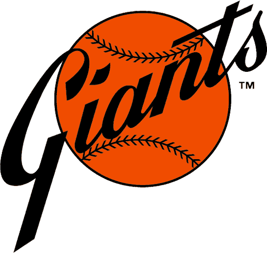
It’s not that I don’t think the Giants logo used from 1947, when they were still in New York, until 1976 wasn’t cool. It was. But the combination of the black “Giants” wordmark and the orange baseball is cooler. It almost looks like a sun, which I dig.
Worst
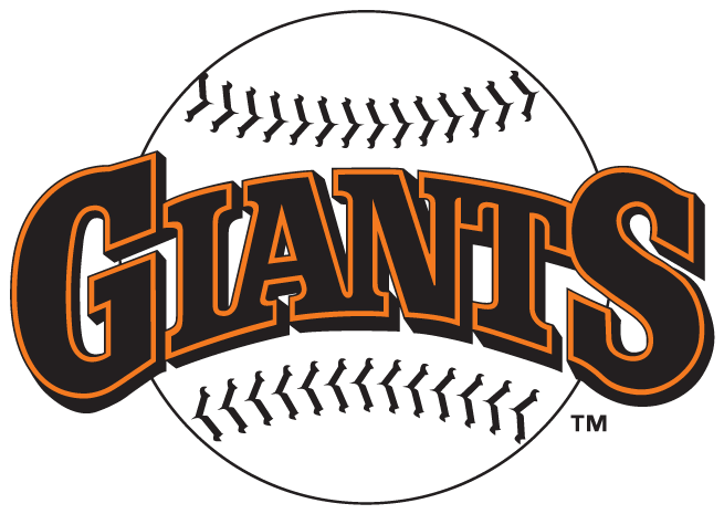
Much like with the Rockies, I can’t really find major fault with any of the Giants’ logos. I went with this one (used from 1983-1993) because when stacked up against the ones that came before and after, it just doesn’t quite measure up. But really it’s not that bad at all.