The Best and Worst NFL Logos (AFC East)

Miami Dolphins Logo (1974 - 1989)

With the 2012 National Football League season nearly upon us, now is as good a time as any to obsess once again on one of my favorite topics — logos. So I’m going to offer up my choices for the best and worst team logos for all 32 current NFL franchises. Primary, alternate, and helmet logos listed on Chris Creamer’s outstanding logo website are all under consideration. Today I look at the four squads of the AFC’s East division.

(For a look at my choices for the best and worst MLB baseball logos, start here!)

Buffalo Bills

Best

Buffalo Bills Helmet Logo (1965 - 1973)
Buffalo Bills helmet logo (1965 – 1973)

I actually dig the Buffalo helmets and uniforms of the late ’70s and early ’80s, but this speaks to the traditionalist in me.

Worst
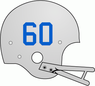
Buffalo Bills helmet logo (1960-61)

As you’ll see in upcoming rankings, plain helmet designs like this are not too uncommon. But Buffalo’s first year in the AFL was 1960, so I’m not sure they have the same excuse a team like Green Bay does. Another point off for their rather derivative color scheme, which owner Ralph Wilson modeled after the Detroit Lions.

Miami Dolphins

Best

Miami Dolphins Logo (1974 - 1989)
Miami Dolphins logo (1974 – 1989)

Sure, there is a certain prestige to this logo, given that it was used for most of Miami’s glory years. But aesthetically, it’s simply their best version. The 1989 update made the dolphin too streamlined.

Worst
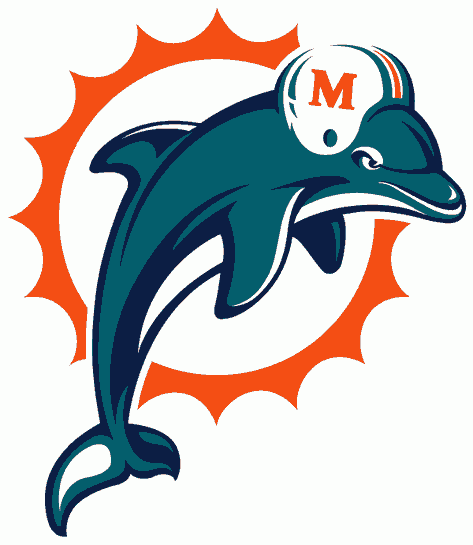
Miami Dolphins Logo (1997 - present)
Miami Dolphins logo (1997 – present)

Not a bad update, but I don’t really care for all these angry mascots popping up in pro sports logos.

New England Patriots

Best

New England Patriots Logo (1971 - 1992)
New England Patriots logo (1971 – 1992)

The classic Patriots logo blurs the line between logo and illustration, but it’s still damn cool. Why they ditched this I’ll never understand.

Worst
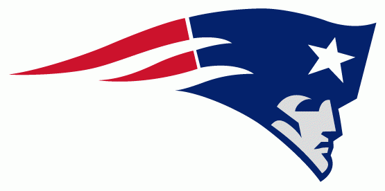
New England Patriots Logo (1993 - 1999)
New England Patriots logo (1993 – 1999)

Ugh, Flying Elvis. I voiced my disgust over this thing years ago, and my opinion hasn’t changed one bit.

New York Jets

Best

New York Jets Logo (1967 - 1977)
New York Jets logo (1967 – 1977)

I appreciate that the Jets moved back to this look in the late ’90s, but it’s not quite the same. For one, this is more accurately shaped like a football. But I have to say, the logo New York used throughout the ’80s and most of the ’90s is better than I remembered it being at the time. I think they just used the wrong shade of green, especially toward the end of the ’90s.

Worst

New York Jets Alternate Logo (2002 - present)
New York Jets alternate logo (2002 – present)

This alternate logo stinks, that silly J-E-T-S chant stinks, and Fireman Ed stinks. There, it needed to be said.

People found this post by searching for:

    "patriots logo", "best nfl logos", "worst nfl logos", "patriots", "miami dolphins", "new england patriots logo", "miami dolphins logo"

2 thoughts on “The Best and Worst NFL Logos (AFC East)

  1. spinetingler

    I’ve hated the Patriots ever since they changed the logo. And got good.

  2. Mike I

    Pat Patriot was ditched, not only because of cost, but because the team was likely heading to St. Louis. I think it was done purposely to make any of the remaining diehard fans not recognize the team and make it easier for a move out of town. New owner James Busch Orthwein only bought the team to move it to Missouri and rename the team the St. Louis Stallions. But, because Bob Kraft owned Foxboro stadium and didn’t accept the buyout, he made Orthwein a ridiculous offer at the time ($175 million), took on a completely insane amount of debt at the time, and within ten years became a billionaire for buying something at the time that no one else in the New England area wanted. I was surprised that the logo was not changed back in 1994 under Kraft’s (who was a long-time season ticker holder) ownership.

    “Flying Elvis” was actually depicted as the famous New Hampshire “Old Man of the Mountain,” and the star over his head was taken from the State Flag of Massachusetts, but really the new logo was just a more streamlined ripoff of the one they tried in 1979.

    Personally, I always liked the Flying Elvis better. I am probably one of the select few who loved the Pats’ uniforms from 1995-1999, with the logo on the shoulder pads and a beautiful large, gaudy font on the back for the player names. It was different. Their current jersey is very clean, but looks similar to many, with the standard logo on the sleeves and numbers on the shoulder pads.

    In terms of aesthetics, Pat Patriot is an impressive drawing and one that will never be replicated by any new team, because every new logo will be done on a computer and not on a canvas. The fortunes of the franchise changed completely with the logo change. The last four years of Pat Patriot, were all losing seasons. The Patriots have only had three losing seasons since Elvis walked into the Foxborough building. It’s nice to see the throwbacks, twice a year, but it is a reminder of when the team was usually an underachiever and the jokes of people saying, you know why Pat Patriot’s bending over, right?

    Looking forward to the rest of your series on the NFL. Your MLB one was a must read. You can be biased on the Raiders, because that may be the best logo in sports. Although, I think as a tribute to Al Davis, the team should replace the pirate, with Al’s face from the latter years of his life. That was way more menacing.

Comments are closed.