The Best and Worst Major League Baseball Logos (NL East)
With the 2012 Major League Baseball season nearly upon us, now is as good a time as any to obsess once again on one of my favorite topics — logos. So I’m going to offer up my choices for the best and worst team logos for all 30 current MLB franchises. Primary, alternate, and cap logos listed on Chris Creamer’s outstanding logo website are all under consideration. Today, for the final installment, I look at the five squads of the National League’s East division.
(Other recaps — AL West, NL West, AL Central, NL Central, AL East)
Atlanta Braves
Best

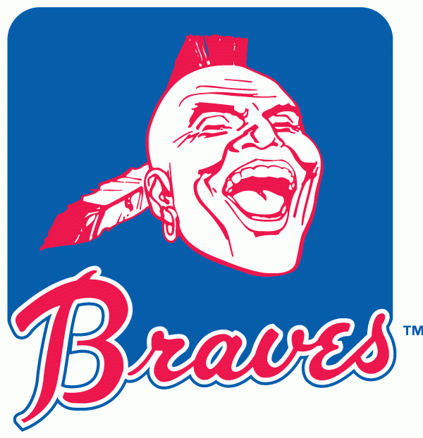
The whole Atlanta Braves look from the ’70s was one of the best in modern baseball, and that includes the primary logo seen here (used until 1986). A close second for this spot was the distinctive feather logo used on the jersey sleeves.
Worst

This cap logo, rolled out in 2003, is a silly, hamfisted attempt to meld the team’s long-lived cap logo with the tomahawk used in the current primary logo.
Miami Marlins
Best

I don’t have a lot to choose from. Prior to the Marlins’ total makeover heading into the 2012 campaign, they had used the same primary logo since their founding in 1993. It’s a decent enough graphic, but I like the 1993-2004 alternate much better. Very nice typeface choice here. It just looks cleaner and leaner than the original primary.
Worst

I have to say, I don’t think this is really all that bad. Sure, this could just as easily represent the Miami Board of Tourism, but it’s original — gotta give the fish that much. The color scheme is pure South Beach, and I like the stylized Marlin. There, I said it. But still, I’m a traditionalist at heart and I had to pick this for the “wag of the finger” slot.
New York Mets
Best

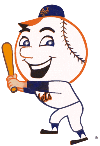
Mr. Met for the win. Simple as that. Pick any variety you want. This is the original alternate, used from 1963-1970.
Worst

Only a diehard Mets fan — is there any other kind these days? — could tell you the difference between this alternate logo and one of the two primary ones. Basically, this is the same as the current primary but is used with the team’s black-based color scheme. And since I don’t care for the Mets wearing black, I don’t care for this version of the logo (which otherwise is quite good).
Philadelphia Phillies
Best

This is the Phillies cap logo of 1970-1991. Great uniforms and a great color scheme. I still have never gotten used to what replaced it, even though it’s been around for 20 years essentially.
Worst

I can dig where they were trying to go with the whole Colonial motif, but this is just too childish. They look like extras from Schoolhouse Rock. Oh and by the way, these kids do have names — Philadelphia Phil and Philadelphia Phyllis. Seriously.
Washington Nationals
Best

Yeah, I went there. Les Expos got screwed in ’94 by the MLB strike, and I still miss them and their logos.
Worst

One of the many variations on the Nats’ basic cap logo. And this one looks like the Walgreens logo, just like the rest of ’em.

I can’t wait for Free Prescription Refill Day at Nationals Park this season!