The Best and Worst NBA Logos (Northwest Division)
I’ve gone through my logo rankings for the NFL and MLB, so now it’s time for the NBA! If you want to see which logos I picked as the best for those leagues, I’ve provided this handy reference page. Otherwise, let’s do some roundball logo reviews. I’m going to take this at an easier pace than I did with football and baseball, so this will be running throughout the NBA 2012-13 regular season.
Up next are the five teams of the Western Conference’s Northwest Division — the Denver Nuggets, Minnesota Timberwolves, Oklahoma City Thunder, Portland Trail Blazers, and Utah Jazz. As always, most of these are sourced from Chris Creamer’s outstanding logo website.
Denver Nuggets
Best

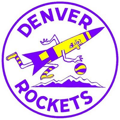
Denver Rockets primary logo (1971 – 1974)
What’s this, you ask? Well, before the Denver Nuggets came to the NBA from the old American Basketball Association (ABA), they were the Rockets. They had to change their name because Houston already had a team called the Rockets. Anyway, I love this. Even more than the classic 1980s Nuggets Tetris skyline logo.
Worst

Denver Nuggets primary logo (1974 – 1981)
Hey look, it’s Yukon Cornelius! And he suffered a hideous leg fracture! Weird.
Minnesota Timberwolves
Best

Minnesota Timberwolves alternate logo (2008 – present)
Yeah it does remind me a little of the Phoenix Coyotes logo, but it’s still cool. I almost went with the original primary, but it’s a little too tame. The pine tree silhouette in the wolf’s fur is a nice touch.
Worst

Minnesota Timberwolves alternate logo (1996 – 2008)
It’s probably telling that the first thing I think of when I see this alternate T-Wolves logo is Madonna’s Immaculate Collection album logo.
Oklahoma City Thunder
Best
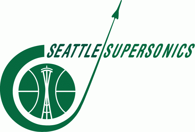
Seattle SuperSonics primary logo (1967 – 1970)
No offense intended to the fine fans of Oklahoma City, but Viva SuperSonics!
I imagine most Seattle fans gravitate to the primary logo used from the mid ’70s to the mid ’90s. You know, the one that looks like this. But the Space Age look of the team’s original logo is just too cool. It’s slick and minimalist at the same time.
Worst
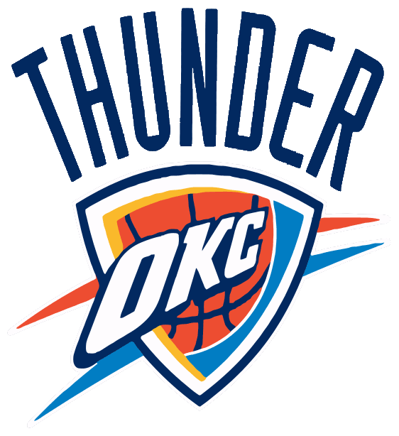
Oklahoma City Thunder primary logo (2008 – present)
Again, no disrespect intended, but this sucks. I said it in 2008 and I stick by it now.
Portland Trail Blazers
Best

Portland Trail Blazers primary logo (1970 – 1990)
For the longest time I thought this was some nifty way of showing the letter B for Blazers. Apparently, though, this is a somewhat abstract visualization of a basketball game, with the two sets of five lines representing the two sets of five players. If that’s true, it’s even more nifty.
Worst
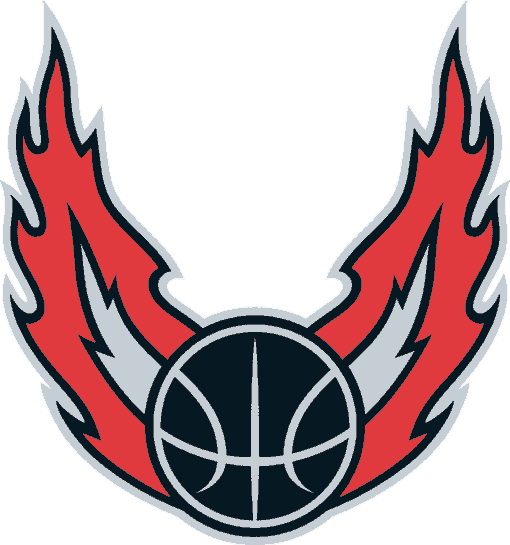
Portland Trail Blazers alternate logo (2002 – 2006)
This one time, I went to a basketball game and a monster truck rally broke out.
Utah Jazz
Best
Utah Jazz primary logo (1979 – 1996)
Although it doesn’t make sense that the New Orleans Jazz kept their nickname when they moved to Utah after the 1978-’79 season, they were wise to keep the logo. This is probably one of my top 10 NBA logos of all time.
Worst

Utah Jazz primary logo (1997 – 2004)
Firstly, points off for speed lines in the wordmark. And secondly, this looks like the logo for some odd brand of soap. You’re not fully clean until you’re Utah Jazz clean!