The Best and Worst NFL Logos (NFC East)
With the 2012 National Football League season nearly upon us, now is as good a time as any to obsess once again on one of my favorite topics — logos. So I’m going to offer up my choices for the best and worst team logos for all 32 current NFL franchises. Primary, alternate, and helmet logos listed on Chris Creamer’s outstanding logo website are all under consideration. Today I look at the four squads of the NFC’s East division.
Previous entries: AFC East
Dallas Cowboys
Best

Dallas Cowboys logo (1964 – present)
I don’t exactly have a wide range of Cowboys logos to choose from, since they’ve only had two main ones since they came into the NFL in 1960. Luckily, their current design is one of the more iconic in the sport.
Worst

Dallas Cowboys alternate logo (1960s)
There are not a ton of examples of this alternate Dallas logo, used in the 1960s, on the internet. I extracted this one from the team’s 1967 media guide. I don’t know — it’s not horrible, but then again it’s hardly iconic is it? It’s kind of goofy and cartoony.
New York Giants
Best

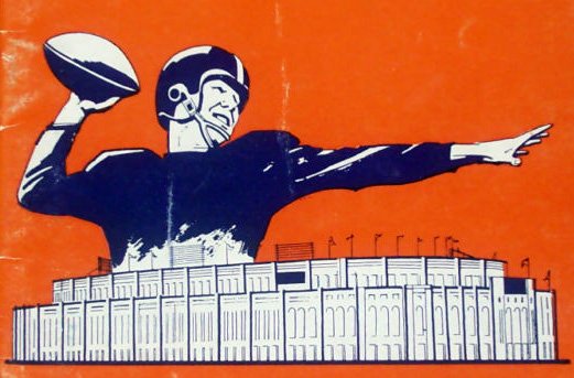
New York Giants logo (1956 – 1960)
Here’s another one extracted from a team publication. This is from the 1959 Giants media guide. In case you’re wondering, that football-throwing giant is towering over the old Yankee Stadium, where New York played from 1956 to 1973. I like the classic “NY” logo they moved back to several years ago, but this one is just so classic and unique. Although to be honest, I haven’t always thought so.
Worst

New York Giants logo (1975)
Yikes! The less said about the entire New York Giants look for 1975 the better.
Philadelphia Eagles
Best

Philadelphia Eagles helmet logo (1969 – 1972)
Eagles fans might cringe at this choice, mainly because the teams that wore this helmet stunk up the joint, but I like it. Mainly because it’s so different than their usual, green-heavy look. It just looks sharp and distinctive to me.
(I was going to use the logo graphic from Chris Creamer’s site but it didn’t do the logo justice.)
Worst

Philadelphia Eagles logo (1996 – present)
I’ve just never warmed up to Philly’s new logo or uniforms. I miss the kelly green, and I miss the old full bird with the football.
Washington Redskins
Best

Washington Redskins logo (1965 – 1969)
I am not against — nor offended by — the Native American profile logo Washington has been using since the early ’70s. But man, once again less is more. And this looks great on the old helmets to boot:

Worst

Washington Redskins alternate logo (1960 – 1965)
Oh my. I’m afraid this is a bit much. Some questions immediately spring to mind, like why does this indian wear a loin cloth when he’s also wearing pants? And what happened to his teeth?
I have to hand it to him, though, those are some major washboard abs.
Thom
I’d probably pick the kelly green for the Eagles, but I do love those green on white helmets. And you will easily find a lot of fans that dislike the current uniforms. People have been calling for a return to the kelly greens for years.