The Best and Worst NFL Logos (NFC North)
With the 2012 National Football League season nearly upon us, now is as good a time as any to obsess once again on one of my favorite topics — logos. So I’m going to offer up my choices for the best and worst team logos for all 32 current NFL franchises. Primary, alternate, and helmet logos listed on Chris Creamer’s outstanding logo website are all under consideration. Today I look at the four squads of the NFC’s North division.
Previous entries: AFC East, NFC East, AFC North
Chicago Bears
Best

Chicago Bears alternate logo (1999 – Present)
This a slightly modified version of the alternate logo used from 1963 – 1992. I was surprised to learn that Chicago went so many years without a logo at all, but they nailed it with this one.
Worst

Chicago Bears alternate logo (1992 – 1998)
I’m gonna cut the Bears some slack for their cutesy early logos, but there’s no excuse for this. That bear looks like it was just poked in the eyes, or maybe he’s just woken up.
Detroit Lions
Best

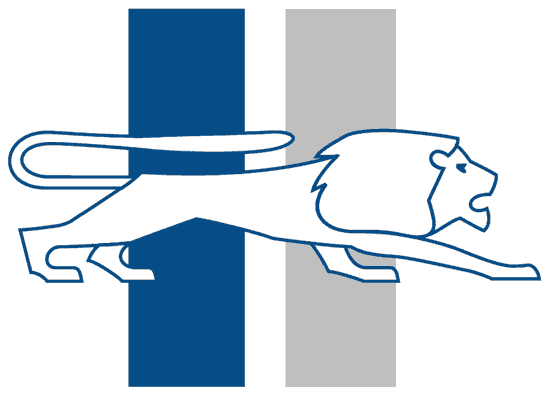
Detroit Lions logo (1961 – 1969)
I can totally see this on some sweet 1960s American sports car. It’s sleek but, yes, a little dated, and I like it.
Worst

Detroit Lions logo (1952 – 1960)
Not terrible really, but it just doesn’t stack up to the few other Detroit logos. Also, the lion looks a little emaciated.
I extracted this old logo from a 1952 Bowman football card, by the way.
Green Bay Packers
Best

Green Bay Packers logo (1961 – 1979)
Simple, timeless. It feels like this has been around forever, although that’s obviously not the case. I actually like this more on the Georgia Bulldogs helmets, but this is great too.
Worst

Green Bay Packers logo (1951 – 1955)
Yeah I know those are goal posts, but they look like crosses from some kind of makeshift combat graveyard. Just too cartoony and lacking identity.
(This is another football card extract, from a 1951 Bowman.)
Minnesota Vikings
Best

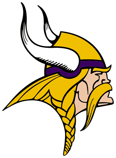
Minnesota Vikings logo (1966 – Present)
I know, the real Vikings didn’t have horns on their helmets. It’s still cool imagery and you know it. I was going to go with the old helmet horn logo, but this wins by the hair on his ample mustache.
Worst

Minnesota Vikings helmet logo (2006 – present)
The entire Minnesota uniform update from ’06 was and is a totally pointless and stupid update. Hate it, hate it, hate it.
Crestline Custom Giveaways
Good list. I think the Vikings 2006 logo is the worst. I know the logo was supposed to represent the horns but it didn’t look that way at all. Way off!