Proud As a Peacock – NBC Logo Evolution
Much angst was generated among TV watchers recently with the consummation of the unholy alliance between Comcast and NBC Universal. This new corporate oligarchy, dubbed NBCUniversal, rolled out a new logo recently that dispensed with the iconic NBC peacock. Many expressed concern that this was to be the new logo for the NBC network. Even Brian Williams seemed perturbed by the loss of the peacock.
Turns out all the worry is over nothing. The NBCUniversal logo, which is awful, is nothing more than corporate branding meant more for internal use than external marketing. The NBC stations that had been using the peacock (NBC, MSNBC, CNBC) will still have it, so fear not Brian. So now that everyone’s blood pressure can come down a few points, I thought it would be nice to take a look at the history of the televised NBC logo, seeing as there’s not a lot about the station to enjoy these days.
NBC Microphone Logo (1940s)

The first NBC Television logo was quite obviously influenced by the network’s radio roots. There are variants of this logo that show it in red and white, but this was what was used for broadcast. The left waves were meant for the radio network, and the right waves were meant for the television network.
Text Wordmark Logo (Early 1950s)

NBC used two animated wordmark logos in the early ’50s, each accompanied by the three-tone NBC chimes that were first heard on NBC radio in 1927. You can see samples here.
Block Wordmark Logo (Early 1950s)

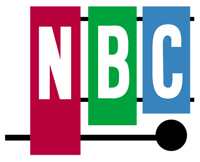
Color Xylophone Logo (1954 – 1959)
In late 1953/early 1954 a stylized xylophone and mallet logo was introduced.
Original Peacock Logo (1956 – 1960)

In 1956, John J. Graham created an abstraction of an eleven-feathered peacock to indicate richness in color. This brightly hued peacock, which NBC called the “Bird,” coincided with an increase in color programming.
Snake Logo (1959 – 1975)

Graham also designed the animated “snake” logo.
Trapezoid N Logo (1976 – 1979)

The short-lived stylized N logo resulted in NBC being sued by a Nebraska TV station for trademark infringement. An out-of-court settlement was reached.
Proud N Peacock Logo (1979 – 1986)

The N lost its color and gained a new peacock in 1979. This is known as the Proud N due to its use in the 1979-1981 “Proud As a Peacock” promotional campaign.
Current Peacock Logo (1986 – present)

Although the current NBC peacock is used with several different styles, it’s essentially the same one that rolled out in ’86. This brand was introduced at the end of NBC’s 60th anniversary TV special.
People found this post by searching for:
- "nbc universal logo", "nbcuniversal logo", "nbc logos through the years", "https://www grayflannelsuit net/blog/pround-as-a-peacock-nbc-logos-throughout-the-years"
