The Best and Worst NBA Logos (Pacific Division)

I’ve gone through my logo rankings for the NFL and MLB, so now it’s time for the NBA! If you want to see which logos I picked as the best for those leagues, I’ve provided this handy reference page. Otherwise, let’s do some roundball logo reviews. I’m going to take this at an easier pace than I did with football and baseball, so this will be running throughout the NBA’s regular season.
In the last edition I covered the Northwest Division, so up next are the five teams of the Western Conference’s Pacific Division — the Golden State Warriors, Los Angeles Clippers, Los Angeles Lakers, Phoenix Suns, and Sacramento Kings. As always, most of these are sourced from Chris Creamer’s outstanding logo website.
Golden State Warriors
Best

Golden State Warriors primary logo (2010 – present)
Warriors fans might be surprised to find this logo over the classic “The City” one from the late ’60s. It was a hard choice for me, but at the end of the day I think the bridge design on this one is more dynamic and appealing than the original. Even if I take points away for the uninspired font choice (copperplate? really?), this is still the best logo in team history.
Worst

Golden State Warriors primary logo (1997 – 2010)
There could only be one… worst Golden State logo. The team gets kudos for at least trying to incorporate an actual warrior in the logo, but not much else. He looks more like the most buff member of Blue Man Group ever.
Los Angeles Clippers
Best

Buffalo Braves primary logo (1971 – 1978)
I’m using my author’s privilege to once again reach deep into a franchise’s past for a cool logo. The Clippers spent their first eight years in the NBA as the Buffalo Braves, and this was their second primary logo. I dig the feather motif, and how it’s incorporated into the big B. This is similar to the sleeve logo the Atlanta Braves used in the ’70s, and I really like that too.
Worst

San Diego Clippers primary logo (1978 – 1982)
In 1978 the Braves left Buffalo and moved west. The team spent six unremarkable years in San Diego as the Clippers, and sported this rather bizarre logo. I get what they were going for here, but the execution is just a little sloppy. This would’ve been much cooler with the sail and sun elements rearranged a little bit.
Los Angeles Lakers
Best

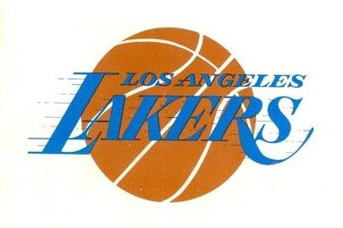
Los Angeles Lakers logo (1960 – 1967)
Before the Lakers adopted their now iconic purple and gold color scheme, they wore the same blue as when they were based out of Minneapolis. Perhaps I’m just jaded after looking at their current logo for so long, but the blue variant just seems a little fresher to me. The design itself isn’t particularly inspired, though.
This was taken from the team’s 1966-67 media guide, by the way.
Worst

Los Angeles Lakers alternate logo (2001 – present)
I’ve got no beef with either of the Lakers’ primary logos, but this alternate one has to go. The only thing it has going for it is restraint, which sort of works against it. Why not get a little creative with an alternate logo?
Phoenix Suns
Best

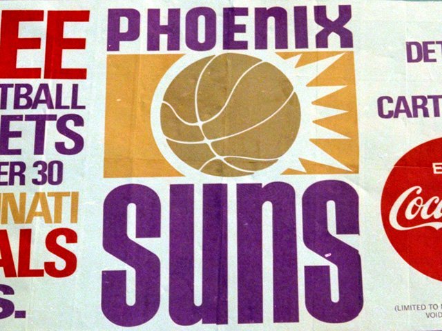
Phoenix Suns logo (1968 – 1992)
Faithful readers of this site will remember that this first Suns logo was featured as part of one of my billboard galleries. I really like the typeface used here, and the color scheme is great too. I also have a soft spot for the alternate logo from this period, as plain as it is.
Worst

Phoenix Suns alternate logo (2000 – 2013)
It’s everything you love about the primary logo from the same period, but pointlessly stretched and distorted!
Sacramento Kings
Best

Cincinnati Royals logo (1957 – 1971)
I understand why a logo like this would never fly in today’s edgy, way-too-serious pro sports world, but dammit I love this so much. This thing was probably outdated as soon as it was rolled out in 1957. It really looks more like something from the 1940s. It’s just so unapologetically cartoonish, you have to admire it. And hey, how come Cincy doesn’t have a pro team anymore?
Worst

Sacramento Kings logo (1994 – present)
This seemed pretty bold and strong when it was unveiled in the mid-’90s, but now it just looks cluttered and messy. So I guess in that respect it’s the perfect symbol for the franchise.
Still, at least it doesn’t have any of those godawful gradients.