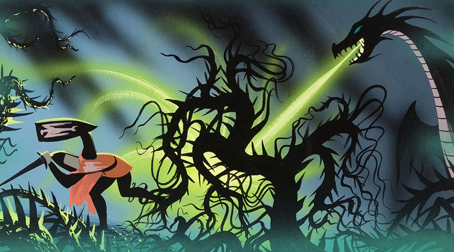
Movies A Gallery of Amazing Disney Concept Artwork by Chris Holmes May 25, 2016 The animate… Read the rest...
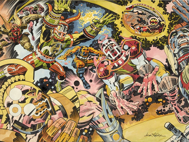
Football Friday, Sports Jack Kirby’s 1973 NFL Artwork Is Fantastic, Trippy As Hell by Chris Holmes October 11, 2013 It’s … Read the rest...
History An Exploded View Drawing of Madison Square Garden, 1967 by Chris Holmes July 25, 2013 According t… Read the rest...
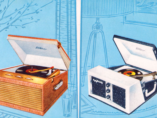
Ephemera The 1959 Symphonic Phonographs Catalog by Chris Holmes July 22, 2013 While on vac… Read the rest...
Ephemera, History Here’s a Terrifying Popular Mechanics Magazine Cover from World War I by Chris Holmes June 17, 2013 I find image… Read the rest...
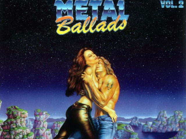
Album Cover of the Week, Music Behold the Strange Beauty of the Metal Ballads Album Covers by Chris Holmes April 15, 2013 I can’… Read the rest...
Retrotisements Springmaid Fabrics, You So Naughty! by Chris Holmes February 25, 2013 Using sex to … Read the rest...
Funny Stuff, Internet These 1980s Star Trek Illustrations Are My Favorite Things Ever by Chris Holmes February 7, 2013 Sometimes, … Read the rest...