Presenting your 2012 London Olympic medal designs
So we’ve already established that the logo for the 2012 London Summer Olympics is an abomination, but what about the medals? Well, they’re half an abomination. See for yourself:

Blimey!
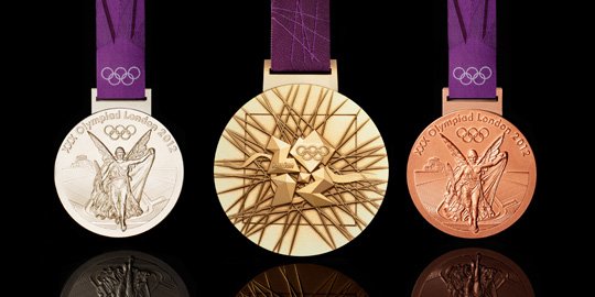
The front of the medals feature “the traditional image of the Greek Goddess of Victory, Nike, stepping out of the Parthenon to arrive in the Host City.” Dammit, is there anything Nike can’t get their image on at this point?
Really it’s not so bad. But then there’s the reverse side, with that hideous logo staring me right in the face. It’s supposed to be a metaphor for modern London. It also contains a portrayal of the River Thames to reflect London, and a square to break up the medal’s circular design and “emphasise its focus on the centre.” See, even the designer (David Watkins) knows it’s so awful that people will naturally avert their eyes.
Oh and the best part is that the gold medals aren’t really even gold. They’re almost 93% silver (and just 1.34% gold).
And I’m not saying I agree with this, but many people think that the logo looks like a certain cartoon character — whose name rhymes with Lisa Simpson — performing a certain sexual act that rhymes with snow job.
Finally, as a frame of reference, here is what the gold medal from the last London Summer Olympics (1948) looked like:


Related articles
- London 2012: Olympic gold medals glitter in public for the first time (guardian.co.uk)
- London’s Olympics Medals Are the Heaviest Bling Yet [Design] (gizmodo.com)
- London 2012: Olympic medals timeline (bbc.co.uk)
- London marks 1-year Olympic countdown (cbc.ca)

Anonymous
The medals look cool. But I am still on the
fence with the logo. Haha… Probably that’s just me but the logo looks a bit
amateurish. Just to share, I recently got my logo design made by the designing
team at http://www.logodesignplanet.co.uk and it turned out excellent. For the
price I paid of only 89 pounds, it was definitely the best deal out there for a
logo design. It came out fantastic and I highly recommend that site. Anyway,
thanks for posting.